
Social preview
How it looks when shared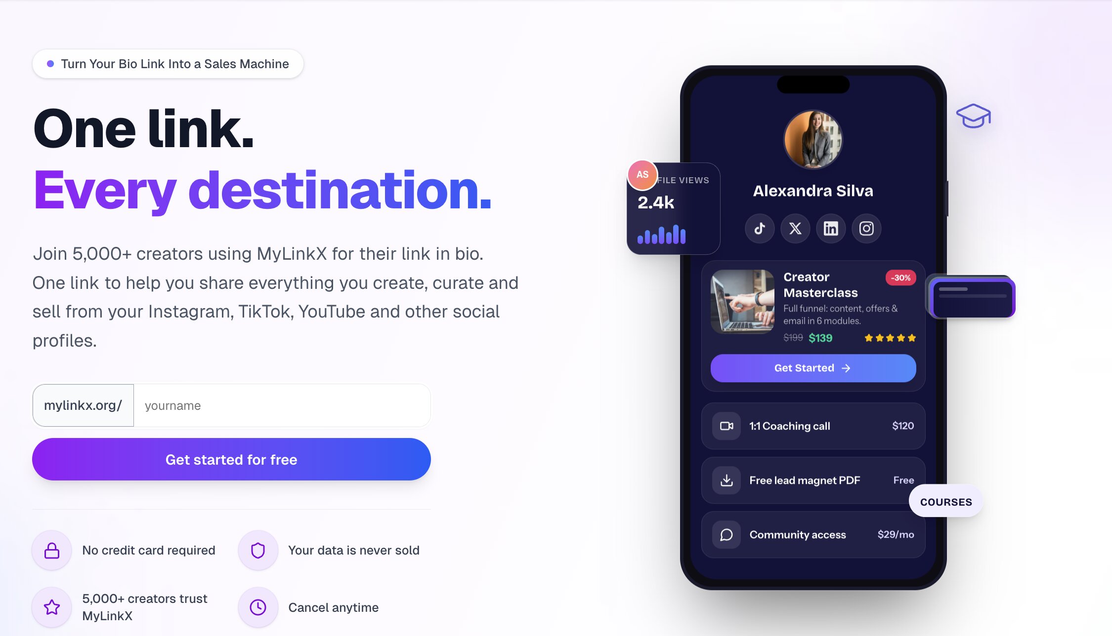
Fix these first
Ranked by conversion impactAdd 3 named testimonials with real photos, creator handles, and a specific result (e.g. '@kanisshka went from 2% CTR to 8.4% in 14 days using MyLinkX') directly below the hero section, before any feature list. Right now the page has zero human validation and cold traffic will not convert without it.
Replace the generic subheadline with a specificity-driven line that names the exact pain and outcome. Change the current flow to read: 'The link-in-bio tool built for creators who sell - track every click, capture emails, and earn more from the audience you already have.' This front-loads the monetization angle that differentiates MyLinkX from Linktree.
Add a money-back guarantee or risk-reversal statement directly next to the primary CTA button. Something like '30-day free trial, no card needed - cancel in one click' displayed as a line of small text under the button. The current trust micro-copy ('No credit card required', 'Your data is never sold') is good but scattered - consolidate it into one trust bar directly under the CTA.
Category breakdown
The primary CTA 'Get started for free' is clear and low-friction, and the supporting micro-copy ('No credit card required') reduces anxiety. However, the CTA appears multiple times on the page without a clear visual hierarchy - it shows up in the hero and again mid-page, which is good, but the button styling and surrounding context are not differentiated enough to create urgency. There is no secondary CTA for visitors who are not ready to sign up (e.g. 'See a live example' or 'Watch a 60-second demo').
This is the page's fatal flaw for cold paid traffic. The only social proof is a repeated '5,000+ creators trust MyLinkX' text claim with no names, no faces, no logos, no screenshots, and no testimonials. The demo profile shown (Kanisshka, 14.2K clicks, 8.4% CTR, 340 sales) is presented as a product mockup, not a real case study - there is no quote from Kanisshka saying this worked. A cold visitor from a Meta or Google ad will not believe unverified numbers from an unknown brand.
The page has pricing transparency (which is good), a security mention, and the 'No credit card required' / 'Cancel anytime' micro-copy. However, there is no money-back guarantee, no founder or team presence, no press mentions, no company legitimacy signals (founding year, location, company name), and no security badge or SSL callout. The domain is mylinkx.org (not .com) which can trigger subconscious skepticism in cold visitors who notice it.
The H1 'Turn Your Bio Link Into a Sales Machine' is clear, benefit-oriented, and passes the 3-second test for anyone who knows what a bio link is. It communicates transformation (not just a feature) and targets creators who want revenue. However, it does not differentiate from competitors - Linktree, Stan Store, and Beacons could all use this exact headline. The subheadline 'One link to help you share everything you create, curate and sell' is weaker and generic.
The page claims 'Mobile-First' design and '90% of bio link clicks happen on mobile' in its own copy, which signals awareness. The hero CTA and headline should render cleanly on mobile. However, the scrolling feature ticker (Real-time analytics, Setup in 2 minutes, etc.) repeated three times is likely a CSS animation that may render poorly or feel spammy on small screens. The problem/solution grid with emoji checkmarks should stack cleanly but the feature card grid may compress awkwardly.
The page lists strong features - 0% transaction fees, custom domain, email capture, real-time analytics - but buries them in a scrolling ticker and feature grid rather than leading with the outcome. The '40% increase in conversions' claim appears mid-page with no source or case study attached, making it feel like marketing fluff. The problem/solution section ('Stop Losing Money on Every Click') is the strongest value prop copy on the page but it appears too far down the scroll.