
Social preview
How it looks when shared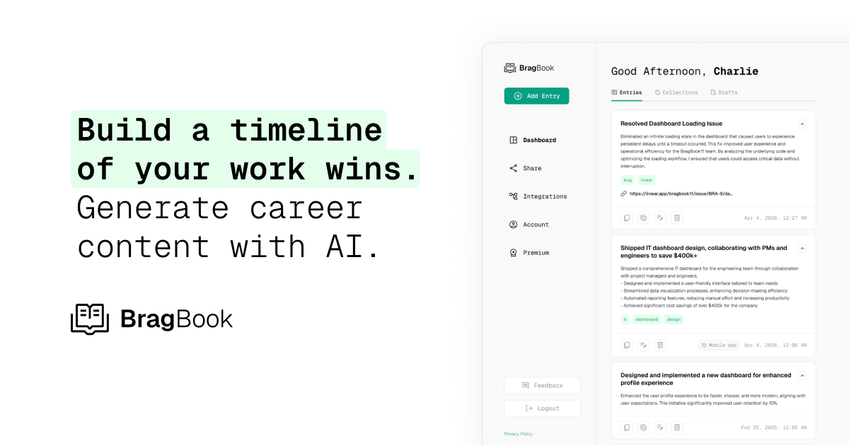
Fix these first
Ranked by conversion impactAdd a high-contrast CTA button directly below the subheadline in the hero section. The button text should change from the generic 'Try BragBook Free' to something outcome-specific like 'Start Tracking Wins Free - No Credit Card' and it should be a large, colored button (not a nav link). This is the single most urgent fix - a page with no detectable hero CTA button is bleeding every visitor who does not scroll.
Add a social proof bar immediately below the hero CTA. Since you have star ratings detected but no testimonials, pull 3 real quotes from actual users (even beta users or early adopters) with their name, title, and company. Place them directly under the hero button. If you have zero users, add a user count like 'Joined by 500+ tech professionals' with a row of avatar icons. A gmail support address combined with zero named proof will kill trust for cold traffic instantly.
Rewrite the H1 to lead with the pain, not the product. Change 'Build a timeline of your work wins' to something like 'Never blank on your performance review again.' Follow it with the current subheadline as the explanation. Cold visitors from paid ads need to feel understood in 3 seconds - 'timeline of work wins' is product language, not pain language.
Category breakdown
The scraper detected zero CTA buttons on the page body - only a nav link labeled 'Try BragBook Free.' This is a critical failure. A cold visitor who lands on the hero and does not look at the nav has no visible action to take. Even if a styled button exists visually that the scraper missed, the fact that it did not register as a button element suggests it may not be prominent enough. There is also no secondary CTA for visitors who are not ready to sign up (no 'See how it works' or 'Watch demo' option).
This is the most dangerous gap on the page. There are no testimonials, no customer logos, no user count, and no named reviews. Star ratings are detected but there is no context - no platform, no number of reviews, no names attached. The support email is a gmail address (usebragbook@gmail.com), which is a significant trust red flag for a paid product asking for personal career data. Cold traffic from ads will see this and immediately question legitimacy.
The page mentions 'Your data, always private' and has a security mention detected, which is good given this product stores sensitive career data. However, the gmail support address is a major legitimacy red flag. There is no money-back guarantee, no team or founder page visible in the hero, no press mentions, and no company registration or 'About' content surfaced above the fold. Pricing exists but is not visible in the hero context. For a product asking users to store private career accomplishments, trust is everything.
The H1 reads 'Build a timeline of your work wins. Generate career content with AI.' A cold visitor can roughly understand this is a career tracking tool, but 'timeline of work wins' is abstract product framing. It does not immediately answer 'is this for me?' for a designer, PM, or dev who just clicked an ad. The subheadline 'Track work accomplishments as they happen. Instantly generate polished summaries, impact statements, performance review prep, and case studies.' is actually stronger and more specific than the headline itself - which means the headline and subheadline are in the wrong order of importance.
With 45 images on the page and a complex app UI demo (the entry cards with tags, links, and dates), there is a high risk that the hero demo section becomes a cluttered, unreadable mess on mobile. The split headline 'Build a timeline of your work wins. Generate career content with AI.' may render awkwardly if it breaks across lines unpredictably. The absence of a proper CTA button element is even more damaging on mobile where nav links are hidden behind a hamburger menu.
The page does communicate a clear use case - tracking work accomplishments and generating career content - but it does not differentiate from simply using Notion or a Google Doc. The copy lists features ('auto-draft impact with AI,' 'share your work with one click,' 'integrate with your favorite platforms') but never states the core differentiated promise: why BragBook over a spreadsheet or Notion template. The 'Built for tech professionals' section and the demo entries showing real metrics (reduced drop-off by 40%, retention from 41% to 68%) are the strongest value signals on the page but they are buried below the fold.