
Social preview
How it looks when shared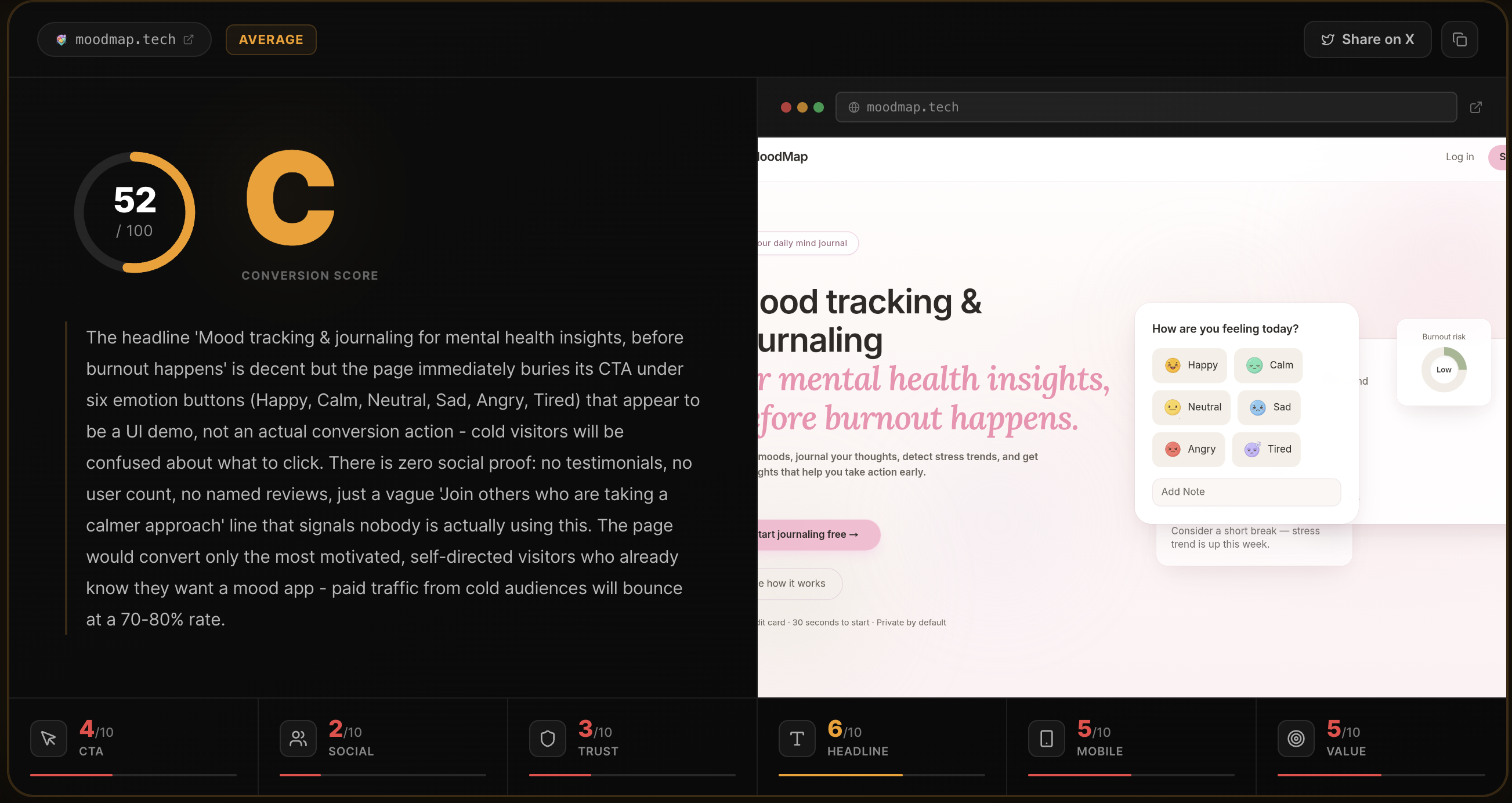
Fix these first
Ranked by conversion impactAdd a real user count or analysis count above the fold, directly under the CTA button. Something like '4,200 pages analyzed' or 'Used by 1,800+ founders' with a live or static counter. Right now there is no signal that anyone has ever used this tool. Place it inline with the existing trust line 'Free for your first analysis - No signup required - Results in ~10s' as a fourth bullet.
Replace the anonymous testimonials (Alex R. @alexr_builds, Priya S. @priyaships) with real, verifiable ones. Add actual Twitter/X profile photos pulled from their avatars, link their handles to real profiles, and if possible embed the tweets as screenshots. Unverifiable initials-only testimonials with no photos actively hurt trust more than having no testimonials at all.
Fix the broken headline rendering. 'Your landing pagehas a conversion problem' is missing a space and reads as a typo on the scraped version. If this is a line-break issue on desktop that collapses on mobile, add a forced space or restructure to 'Your landing page has a conversion problem - find out why in 10 seconds.' A typo in the H1 destroys credibility instantly for cold traffic.
Category breakdown
The primary CTA 'Analyze my page free' is benefit-forward and low-friction, which is correct. It appears twice on the page. The supporting copy 'Free for your first analysis - No signup required - Results in ~10s' directly addresses the three biggest objections (cost, friction, time) and is well-placed directly under the button. The secondary CTA 'Go Pro - $29/mo - Unlimited Analyses' is clear on pricing. The FAQ CTAs 'How does it work?' and 'Is it really free?' are good for hesitant visitors. The main weakness is that the input form (URL field) is not visible in the hero - visitors click the CTA and then have to find where to paste their URL.
There is a testimonial section titled 'They saw the gaps. Then they fixed them.' with three quotes from Alex R., Priya S., and a third person. None have profile photos, none have verifiable links, none have last names, and the writing style across all three is suspiciously similar (lowercase, casual, self-deprecating). There are no customer logos, no user counts, no press mentions, no star ratings, and no case study links. The 'notion.so was just analyzed' live ticker is a clever touch but a single domain name is not social proof - it just shows the tool works.
The page has almost no trust infrastructure for cold traffic. There is no money-back guarantee, no security or privacy badge near the form, no company description, no team page, and the footer attribution is just 'Rohan Gotwal' with no title, company name, or LinkedIn link. The pricing section exists ($29/mo) which is a positive signal, but without any trust anchors around it, cold visitors will hesitate to enter payment info. The 'No signup needed' badge in the hero is good for the free tier but does nothing to build trust for the paid conversion.
The H1 'Your landing page has a conversion problem' is punchy and problem-aware, which is good for warm traffic. But for cold paid traffic who landed from a generic ad, it assumes they already know they have a conversion problem - it does not tell them what the product IS or what it does. A visitor has no idea in 3 seconds whether this is a consulting service, a heatmap tool, or an AI audit. The subheadline 'You're sending traffic to a page that doesn't convert. Find out exactly why. In 10 seconds, free.' rescues it somewhat, but it is below the fold on mobile.
The page structure suggests a single-column layout that should adapt reasonably to mobile. The hero CTA 'Analyze my page free' should be thumb-accessible. However, the H1 rendering issue ('Your landing pagehas a conversion problem' missing a space) suggests possible mobile line-break problems where words are colliding. The features grid (Conversion Score, Social Preview Check, Top 3 Fixes, 6-Area Breakdown, Shareable Scorecard) likely collapses to a single column on mobile which is fine, but the scorecard preview image (the one image on the page) may not scale correctly. The navigation bar with 5 links (Features, How it works, Pricing, FAQ, Contact) will likely compress into a hamburger menu - ensure the CTA button is still visible without opening the menu.
The page does communicate a clear outcome - a 0-100 score with specific fixes - and the '10 seconds, free' angle is a strong hook. The features section ('Conversion Score', 'Top 3 Fixes', '6-Area Breakdown', 'Shareable Scorecard') is well-structured. However, the differentiation from competitors like Unbounce's analyzer or manual CRO audits is never stated. The copy 'No vague advice, just verdicts and fixes you can act on today' is the strongest value prop line on the page and it is buried in the features section, not in the hero.