Social preview
How it looks when sharedFix these first
Ranked by conversion impactReplace the H1 'Apple' with a product-specific value headline for whatever product your ad is promoting. If the ad is for iPhone, the hero H1 should read something like 'The New iPhone - The Most Personal iPhone Ever. Starting at $X.' The page currently wastes the hero moment on brand name alone, which only works for direct navigational traffic, not paid cold traffic.
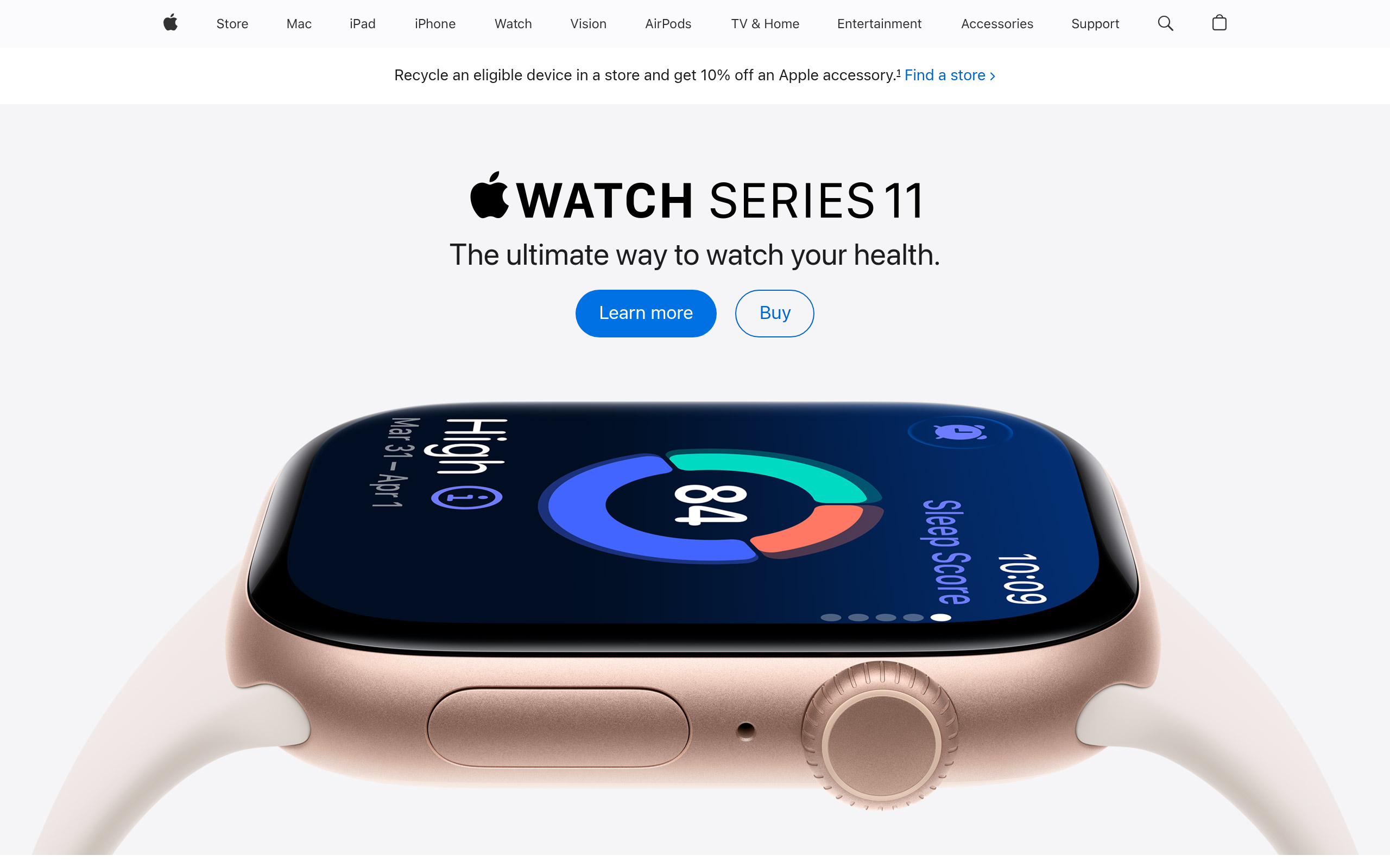
Add a single dominant primary CTA above the fold. Right now there are at least 10 competing CTAs visible immediately: 'Learn more', 'Shop iPhone', 'Buy', 'Learn more', 'Buy' repeated across multiple products. Pick ONE product to hero and make ONE button the clear primary action. Remove or visually demote all competing CTAs in the first viewport.
Add at least one trust-building social proof element in the hero section - specifically a line like '2 billion active devices worldwide' or a star rating aggregate from verified buyers. There are zero testimonials, zero star ratings, and zero user count mentions on this page, which is a critical gap for any cold visitor who is not already an Apple loyalist.
Category breakdown
There are at least 15 CTA buttons visible on this page including 'Learn more', 'Buy', 'Shop iPhone', 'Get your estimate', 'Apply now', 'Stream now', and more. This is classic CTA paralysis. No single button is visually dominant. The 'Buy' buttons are small and repeated identically across multiple products, creating confusion rather than direction. There is no urgency, no scarcity, and no friction-reducing language like 'No commitment' or 'Free returns'.
There are zero testimonials, zero star ratings, and zero named customer reviews anywhere on this page. The only social proof signal is implied brand recognition. Customer logos are noted as present but these appear to be app/partner logos in the entertainment section, not B2B trust logos. For a company with billions of customers, this page is shockingly empty of proof.
Apple has strong implicit brand trust but the page itself does surprisingly little to reinforce it for a skeptical first-timer. Positives: pricing is present, money-back mention exists (likely in fine print), security mention is present. Negatives: the money-back guarantee is buried in footer legal text, not called out prominently. No '14-day return policy' badge near the CTA. No 'Apple Authorized' or security checkout badge visible. The trade-in offer fine print is 200 words of legal disclaimer which actively erodes trust.
The H1 is literally the word 'Apple'. A cold visitor landing on this page from a paid ad has zero context about what action to take or what specific product is being offered. The subheadlines like 'MacBook Neo - Amazing Mac. Surprising price.' and 'iPhone - Meet the latest iPhone lineup.' are better but they are buried below the fold and compete with each other. No single message dominates.
Apple is known for strong mobile design and the page structure suggests responsive layout with 49 images optimized for various viewports. The product carousel format works reasonably well on mobile. However, the multi-CTA problem is worse on mobile where screen real estate is limited and 'Learn more' plus 'Buy' buttons stacked on small cards create tap confusion. The entertainment content section with 'Item 1 through Item 9' labels suggests a carousel that may not render cleanly on all devices.
Individual product cards have decent micro-value props: 'The world's best in-ear Active Noise Cancellation' for AirPods Pro 3, 'Now with M5, M5 Pro, and M5 Max' for MacBook Pro. But there is no overarching value proposition for the page as a whole. The page assumes the visitor already wants Apple products and just needs to pick one. Cold traffic needs to be sold on WHY Apple, not just WHICH Apple.