
Social preview
How it looks when shared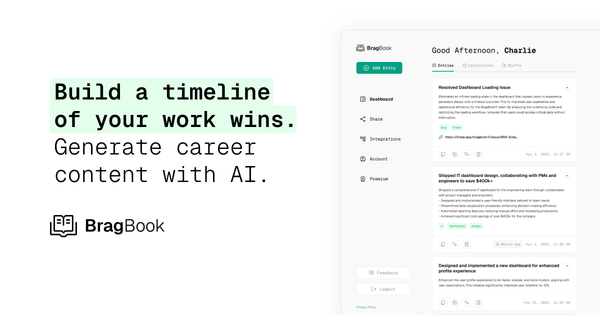
Fix these first
Ranked by conversion impactAdd a high-contrast CTA button directly below the subheadline in the hero section. The button text should change from the generic 'Try BragBook Free' to something outcome-driven like 'Start Tracking My Wins - Free' or 'Get My First Entry in 2 Minutes'. This button needs to exist as a standalone element in the hero, not just in the nav bar. A dev can add this in under 30 minutes.
Add a social proof bar immediately below the hero CTA. Since there are no testimonials yet, use a stat-based placeholder like '2,400+ tech professionals tracking wins' or pull 2-3 real quotes from early users/beta testers with their name, title, and company. Place this between the hero and the first feature section. Even a single named quote with a real photo will dramatically reduce bounce rate for cold traffic.
Rewrite the hero headline to lead with the outcome, not the feature. Change 'Build a timeline of your work wins' to something like 'Never Blank on Your Performance Review Again' or 'Stop Forgetting the Work That Got You Promoted'. The current headline describes the tool; the new one should describe the pain it eliminates. Keep the AI angle in the subheadline.
Category breakdown
The scraper detected ZERO CTA buttons in the page body. The only CTA is 'Try BragBook Free' in the navigation bar, which is a low-visibility placement. A cold visitor who is not actively looking for a nav link will scroll through the entire page without a clear prompt to act. This is a critical conversion failure - there is no moment of decision being created for the visitor.
There are star ratings detected but no testimonials, no customer logos, no user count, and no named reviews. For a cold traffic visitor arriving from a paid ad, this is a trust vacuum. The page shows a demo UI with fake user data ('Charlie') which is fine for product illustration, but there is zero evidence that real humans use or endorse this product. The contact email is a Gmail address (usebragbook@gmail.com) which actively undermines credibility.
The page mentions 'Your data, always private' and has a security mention, which is good. There is a pricing section and a free trial mention. However, the Gmail contact address (usebragbook@gmail.com) signals a very early-stage or solo project, which creates doubt. There is no money-back guarantee, no founder story, no company information, and no press mentions. The 'About' nav link exists but its content is not visible in the scraped data.
The H1 reads 'Build a timeline of your work wins. Generate career content with AI.' A cold visitor can roughly understand this is a career tracking tool, but 'timeline of your work wins' is vague jargon. It does not immediately communicate who this is for (tech professionals), what problem it solves (forgetting accomplishments, struggling with perf reviews), or why AI matters here. It takes 2-3 seconds just to parse the line break structure.
With 45 images on the page and a complex demo UI showing a sidebar navigation ('Entries, Collections, Drafts'), there is a high risk that the product screenshot becomes unreadable on mobile screens. The headline split 'Build a timeline / of your work wins. / Generate career content with AI.' likely renders as three short lines on mobile which may look fragmented. The absence of body CTA buttons is even more damaging on mobile where nav bars are often hidden behind a hamburger menu.
The subheadline 'Track work accomplishments as they happen. Instantly generate polished summaries, impact statements, performance review prep, and case studies.' is actually the strongest copy on the page - it lists concrete outputs. However, it is buried as supporting text and the page never answers 'why BragBook over a Google Doc or Notion?' The differentiation angle of AI-generated impact statements is mentioned but not demonstrated with a before/after example.