Social preview
How it looks when shared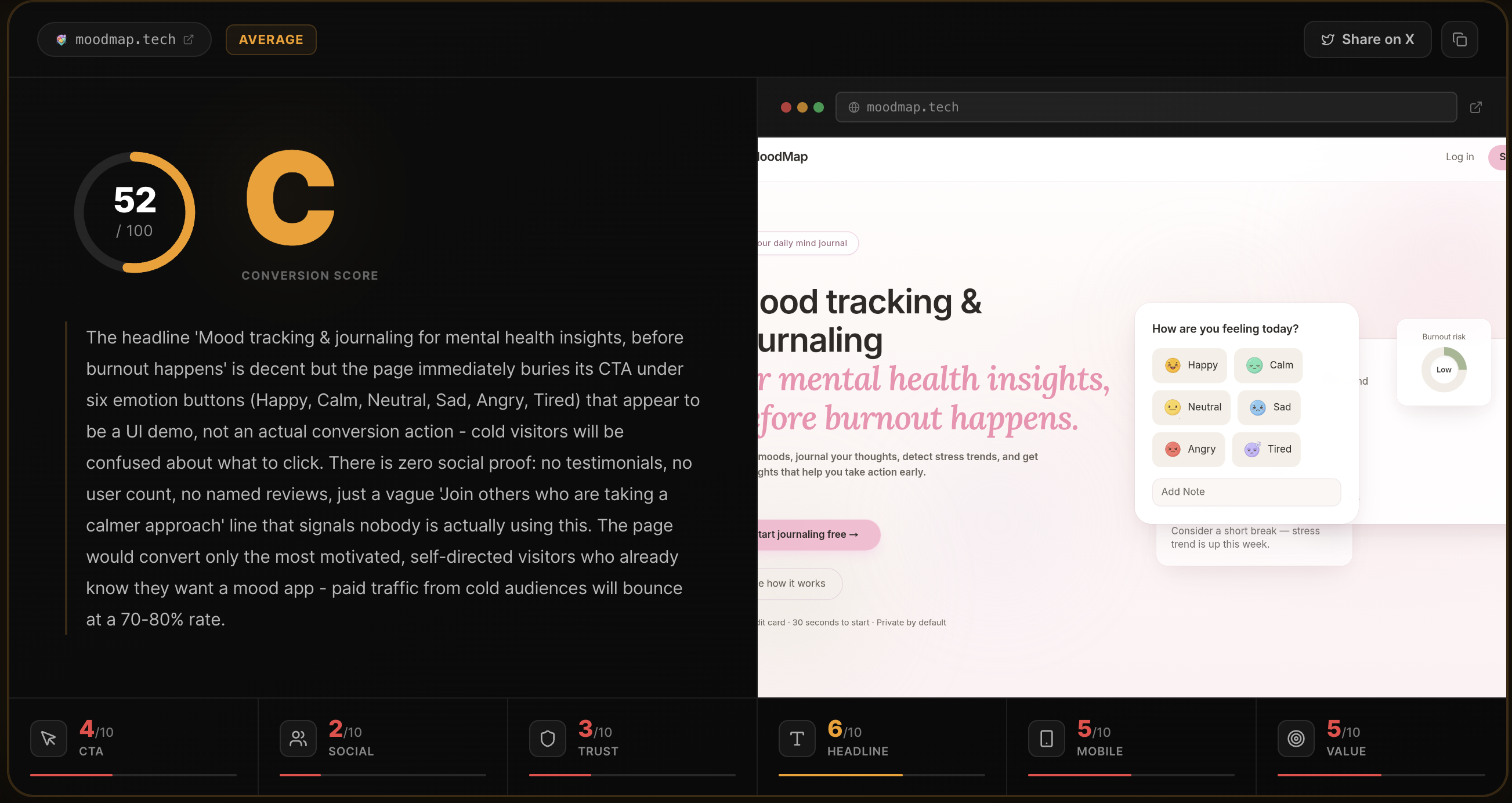
Fix these first
Ranked by conversion impactAdd a live user count or analyses-run counter directly under the H1, something like '4,200+ pages analyzed this month' - even a modest real number destroys the 'ghost town' perception that kills cold traffic. Place it between the subheadline and the CTA button, in small muted text, same line as the existing trust micro-copy ('Free for your first analysis - No signup required - Results in ~10 seconds').
Add 3 named testimonials with real outcomes immediately below the hero section, before 'What you get'. Format: avatar photo, name, Twitter handle, one-sentence quote that references a specific result like 'Found out my CTA was invisible on mobile - fixed it in 20 minutes and signups went up 30%'. Without this, the page is a founder talking about their own tool with no outside validation.
Change the PRO CTA button text from 'Unlock unlimited analyses' to 'Start Pro - $29/mo, cancel anytime' and add a single line underneath: 'No contracts. Cancel in one click.' The current copy sounds like a locked gate, not an upgrade. The friction perception is higher than the actual friction.
Category breakdown
The primary CTA 'Analyze my page free' is clear, action-oriented, and low-friction. It appears three times on the page which is appropriate for a single-action page. The micro-copy underneath ('Free for your first analysis - No signup required - Results in ~10 seconds') directly addresses the three biggest objections a cold visitor has. The weakness is that there is no visual description of the button color or contrast, and the CTA competes with five navigation links at the top including 'Features,' 'How it works,' 'Pricing,' 'FAQ,' and 'Contact' which give visitors escape routes before they ever reach the form.
There is no social proof of any kind on this page. No testimonials, no user count, no logos, no star ratings, no press mentions, no case studies, no named users. The only external signal is a Twitter handle in the footer (@Rohan27s). For a tool asking visitors to trust an AI verdict on their business, the complete absence of third-party validation is the single biggest conversion killer on this page. Cold traffic will not convert without it.
The page has a pricing section and a free tier which are positive signals. The 'No signup required' copy reduces friction. However there is no money-back guarantee on the Pro plan, no security or privacy badge near the form, no company information beyond a Twitter handle, no team or founder photo, and no indication of how many pages have been analyzed. The footer contains only Privacy, Terms, and a Twitter link - which is the minimum viable legitimacy signal, not a trust builder. A $29/month purchase decision requires more than this.
The H1 'Getting traffic but not enough signups?' immediately speaks to a real, painful problem that the exact target user experiences daily. It passes the 3-second test for relevance. However, it does not tell you what the product IS - it only names the pain. The subheadline and supporting copy ('Paste your URL. Get a brutal honest conversion score across 6 dimensions') do the heavy lifting to explain the solution, but a cold visitor has to read two lines before they understand this is a landing page analysis tool.
The page has zero images which is actually a mobile advantage - no broken image layouts or slow-loading hero graphics. The single form and clear CTA hierarchy should translate reasonably to mobile. The main risk is the five-item navigation bar which will either collapse poorly or crowd the header on small screens. The feature grid ('Conversion Score,' 'Social Preview Check,' etc.) likely renders as a multi-column layout that may stack awkwardly. The pricing section with two cards should stack cleanly.
The core value prop - 'verdicts and fixes, not vibes' - is genuinely differentiated and well-articulated. The '6 dimensions' framing, the shareable scorecard, and the social preview check are concrete outputs that competitors do not bundle together. However, the page never states the outcome in customer terms: 'more signups,' 'higher conversion rate,' 'stop wasting ad spend.' The features are listed but the transformation is implied, not stated. The copy 'Honest callouts tied to signups and trials - not generic advice you have already ignored' is the best line on the page and it is buried in Step 02.