Social preview
How it looks when shared
Fix these first
Ranked by conversion impactReplace the H1 'Pause' (which appears to be a JS animation artifact, not intentional copy) with a real headline. Use something like: 'One AI workspace for docs, projects, and agents - used by 100M+ teams.' This immediately communicates what the product is, who uses it, and the scale of trust. A dev can hardcode this as the default H1 before any animation triggers.
Move the social proof ticker ('Over 100M users worldwide', '#1 knowledge base 3 years running', '62% of Fortune 100') to directly below the hero CTA button, not buried mid-page. Cold visitors need trust signals within the first scroll, not after reading feature descriptions. Place at least 3 of these stats in a single row immediately under the 'Try for free' button.
The primary CTA 'Try for free' is generic and undersells the offer. Change it to 'Start free - no credit card required' and add a single line of microcopy beneath it: 'Join 100M+ users. Free plan available forever.' This reduces friction anxiety and reinforces the scale signal at the exact moment of decision.
Category breakdown
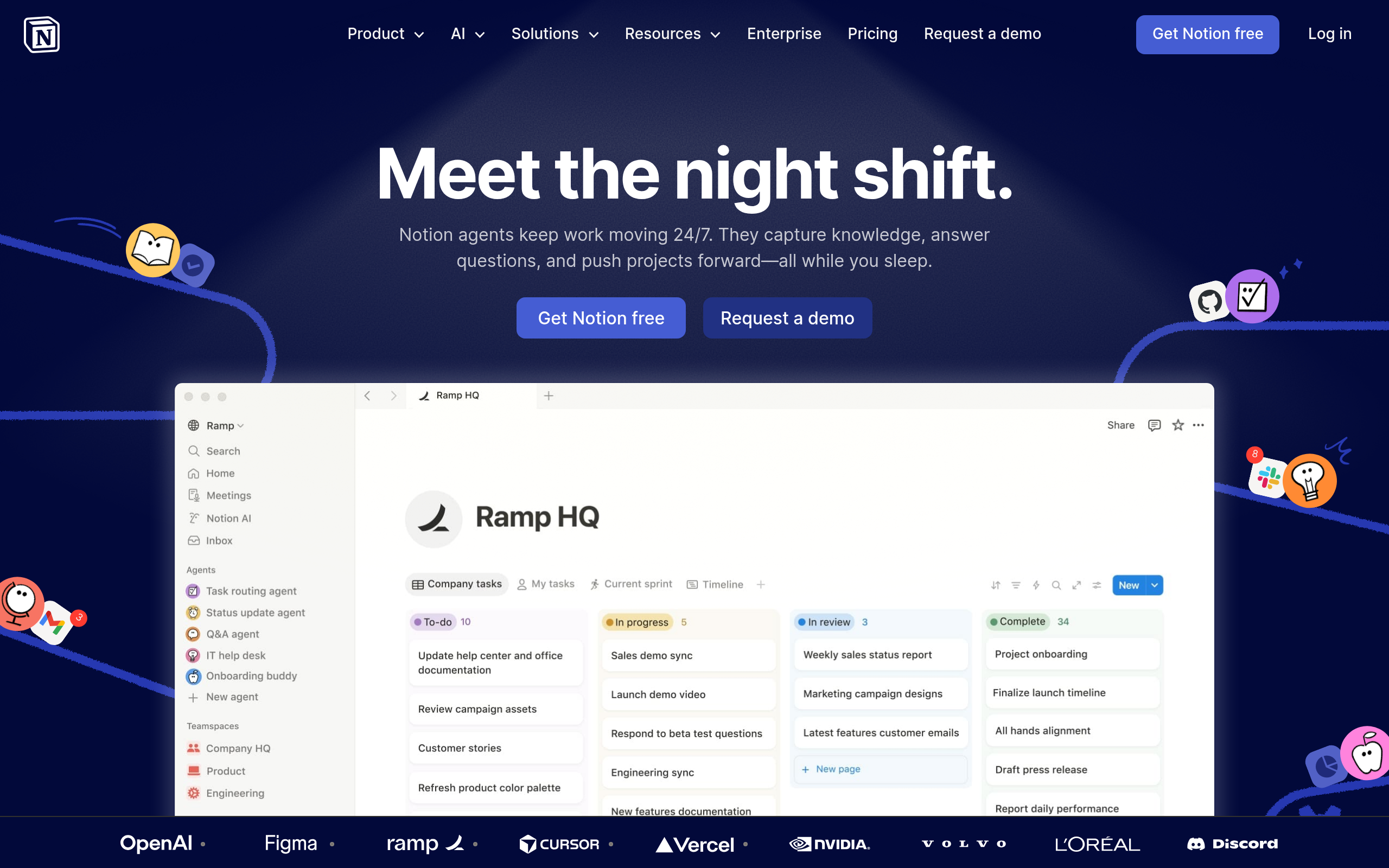
The primary CTA 'Try for free' is present and a free trial is mentioned, which reduces friction. However, 'Try for free' is the most generic SaaS CTA in existence and does nothing to reinforce the specific value of Notion. There also appear to be multiple competing CTAs: 'Try for free', 'Get started on Notion', 'Download for Mac', 'Download Notion Mail', 'Download Notion Calendar' - this creates decision paralysis for cold visitors who are not yet sold on the product.
The social proof inventory is actually strong: 100M+ users, Forbes Cloud 100 trusted by 98%, 62% of Fortune 100, 50%+ of YC companies, G2 rankings for knowledge base and AI search, 1.4M community members, and customer quote snippets from named companies like Ramp. The problem is placement and format - the stats appear in a scrolling ticker mid-page and the testimonials are teaser quotes without full attribution (no names, no titles, no company logos visible in the scraped data). Customer logos are present but unnamed testimonials reduce credibility.
Trust signals are above average for a SaaS landing page: Forbes Cloud 100 claim, G2 category leadership in 3 categories, 100M user count, Fortune 100 penetration, and YC company adoption. These are credible, specific, and verifiable. What is missing: no money-back guarantee mention, no security/compliance badges (important for enterprise buyers), no pricing transparency in the hero (pricing exists but requires scrolling), and no founder or team presence to humanize the brand for skeptical cold visitors.
The H1 is 'Pause' - this is almost certainly a JavaScript animation state being captured mid-render, not intentional headline copy. A cold visitor landing on this page sees a single meaningless word as the most prominent text on the page. Even if the intended headline is 'Your AI everything app' or 'Keep work moving 24/7', neither of those clearly explains what Notion is to someone who has never heard of it. 'AI everything app' is a category claim, not a benefit statement.
The page structure raises several mobile concerns. The savings calculator with a table of 12 tool prices and a team size slider is almost certainly unusable on mobile without significant responsive design work. The scrolling ticker with 7+ social proof stats will be hard to read on small screens. The multiple download CTAs (Mac, Mail, Calendar) are desktop-oriented and create confusion for mobile visitors. The hero 'Pause' H1 issue is amplified on mobile where there is less context to compensate.
The page does eventually communicate a strong value prop - the savings calculator showing $340/month saved by consolidating tools is genuinely compelling and differentiated. The 'More productivity. Fewer tools.' framing and the list of tools Notion replaces (AI Search $35, AI Chatbot $20, etc.) is smart competitive positioning. However, this is buried mid-page. The above-the-fold copy 'Your AI everything app' is too abstract for cold traffic who need to immediately understand the consolidation angle.