
Social preview
How it looks when shared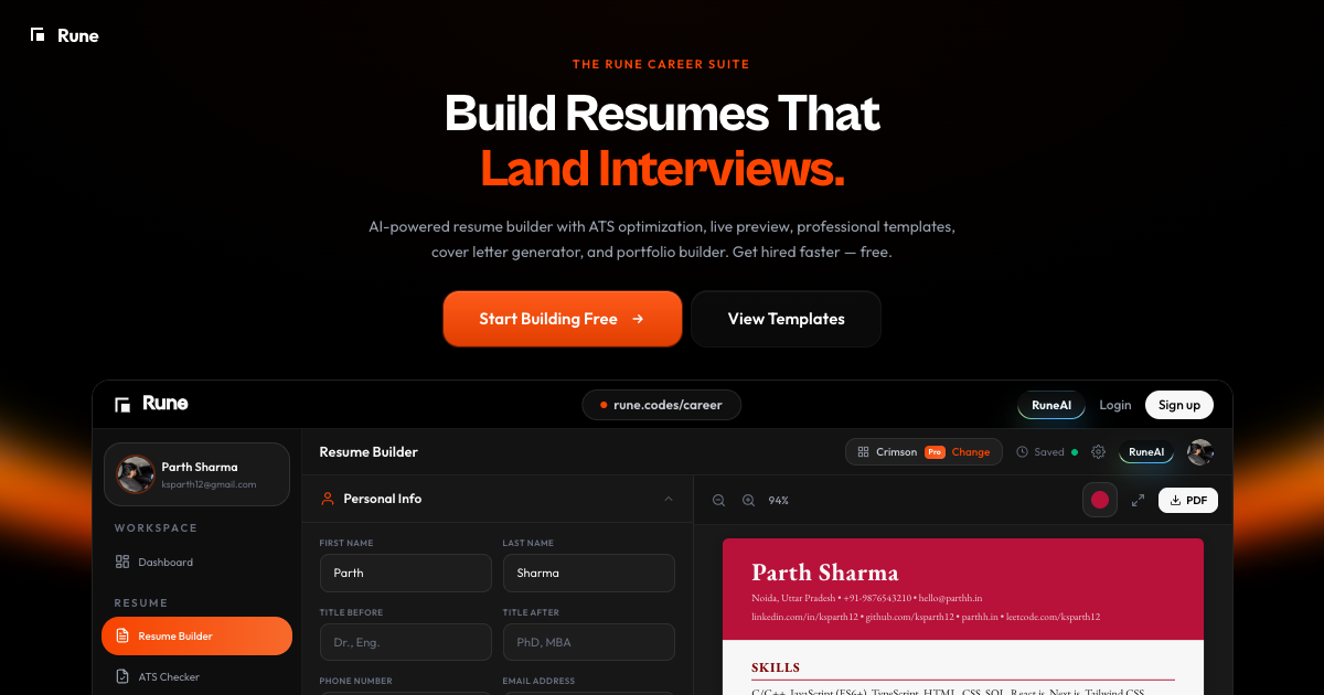
Fix these first
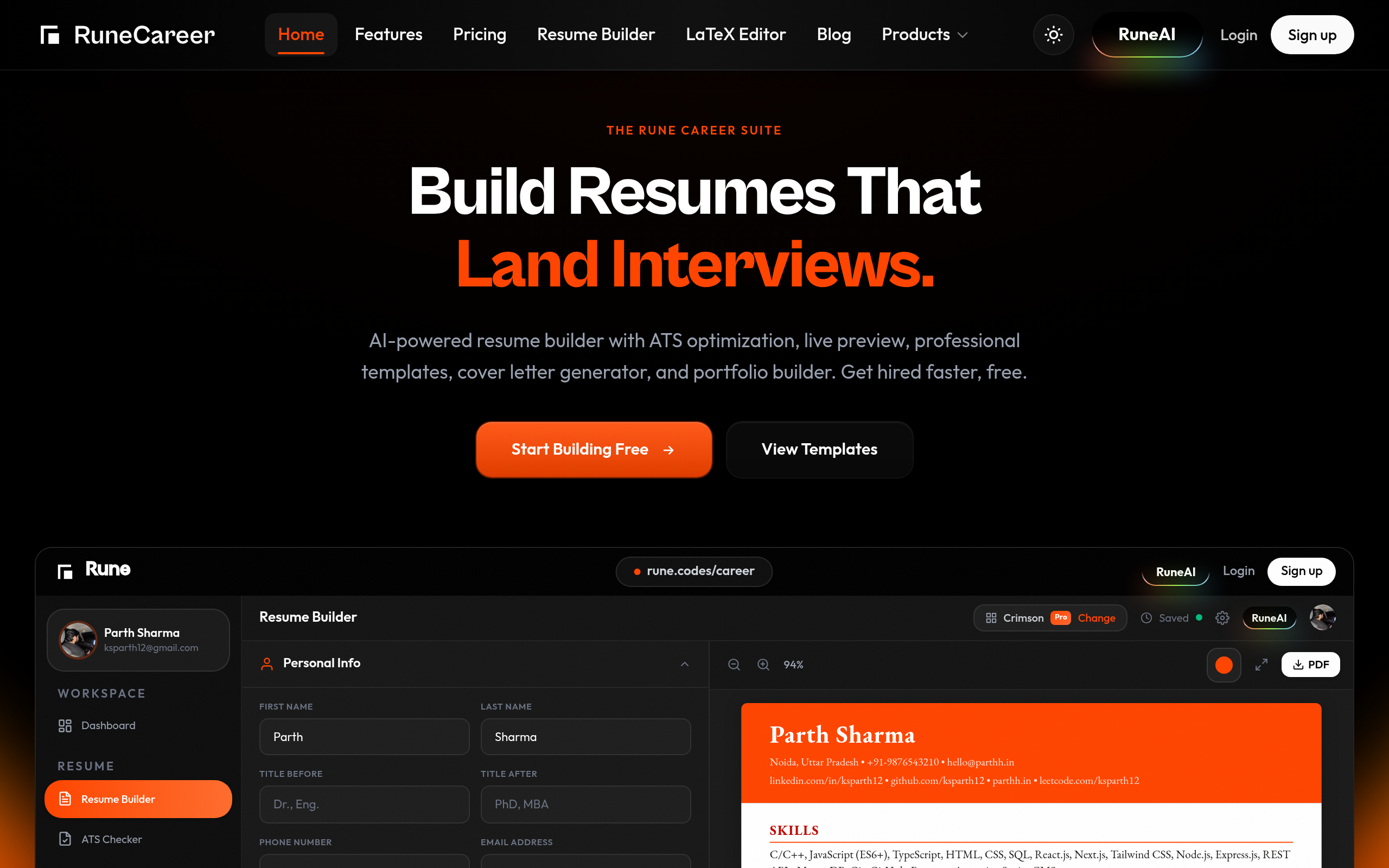
Ranked by conversion impactReplace the FAQ-style CTA buttons ('What is Rune Career?', 'Is Rune Career free?') with a single high-contrast primary CTA button above the fold that reads 'Build My Free Resume in 2 Minutes' - this removes ambiguity, communicates zero cost, and sets a time expectation that reduces friction. The current 'Start Building Free' button exists but is visually competing with 'View Templates' and the nav bar. Make 'Start Building Free' the only above-fold action, remove 'View Templates' from the hero, and increase button size by at least 40%.
Add 3-5 named testimonials with job titles and companies (e.g. 'Got a Google offer in 3 weeks - Sarah K., Software Engineer') directly below the hero section. The page shows customer logos (Microsoft, Google, Apple, etc.) but these appear to be aspirational brand logos, not actual customers - which is misleading and erodes trust. Either remove these logos entirely or replace them with a stat like '47,000 resumes built' or '83% of users report more interview callbacks' with a source. Fake social proof is worse than no social proof.
Collapse the navigation from 10+ links down to 3 maximum (Features, Pricing, Sign Up) and remove the dual-nav bar that appears to show two separate navigation menus. The page text shows 'RuneCareerHomeFeaturesPricingResume BuilderLaTeX EditorBlogProductsRuneAI' repeated twice, which means visitors are seeing a cluttered header that signals an unpolished product before they even read the headline.
Category breakdown
The primary CTA 'Start Building Free' exists in the hero but is visually competing with 'View Templates' and a 10-link navigation bar. More damaging: the page lists FAQ-style buttons as CTAs - 'What is Rune Career?', 'Is Rune Career free?', 'Will my resume actually pass ATS systems?' - these are not CTAs, they are objection signals that tell the visitor the page failed to answer basic questions. The 'Products' button in the nav is especially confusing since the visitor is already on a product page.
The page has star ratings but no named testimonials, no user count, and no case studies. The customer logos (Microsoft, Shopify, Nike, Netflix, Google, Amazon, LinkedIn, Apple) are almost certainly aspirational placeholders, not actual enterprise customers - displaying these without context like 'trusted by employees at' is a trust liability, not an asset. There are zero named testimonials despite the scrape confirming 'has testimonial section: no'. Star ratings without review text or reviewer names are meaningless to a skeptical cold visitor.
There is no money-back guarantee, no security mention, no free trial callout (despite the product being free), no founder presence, and no company legitimacy signals beyond a logo. The pricing section exists but there is no transparency about what 'free' actually includes versus paid tiers - this creates anxiety for visitors who fear bait-and-switch. The 'RuneAI Assistant - Online now' widget is a nice touch but appears mid-page in a context about learning, not resume building, which is confusing.
The H1 'Build Resumes That Land Interviews.' is clear and outcome-focused - a cold visitor understands the product category in 3 seconds. The subheadline 'AI-powered resume builder with ATS optimization, live preview, professional templates, cover letter generator, and portfolio builder. Get hired faster, free.' is feature-list heavy but does communicate scope. The problem is the page then immediately fires 6 more H2s at the visitor ('Three Pillars. One Career Engine.', 'Supercharge Your Job Search with AI', 'Way beyond a resume builder...') creating cognitive overload that kills the clarity the H1 established.
The dual navigation bar (two separate nav menus visible in the scraped text) will almost certainly collapse into a broken or cluttered mobile header. The scrolling logo ticker (Microsoft, Shopify, Nike repeated) is a common mobile performance drag. With 20 images and 6+ competing H2s, the above-fold mobile experience likely buries the CTA below the fold on most phones. The FAQ-style CTA buttons will render as a confusing list of tappable text on mobile, not clear action items.
The page tries to sell three distinct products simultaneously - resume builder, ATS optimizer, and interview prep - which dilutes the value prop for cold traffic. 'Three Pillars. One Career Engine.' is clever copy but it asks visitors to do mental work to understand what they're getting. The copy 'Way beyond a resume builder...' is a missed opportunity - it teases differentiation but the follow-up copy ('No need to think much. We guide you through every step') is generic and could describe any resume tool. The actual differentiator - paste a job link and get a pre-built tailored resume in 2 minutes - is buried halfway down the page.