
Social preview
How it looks when shared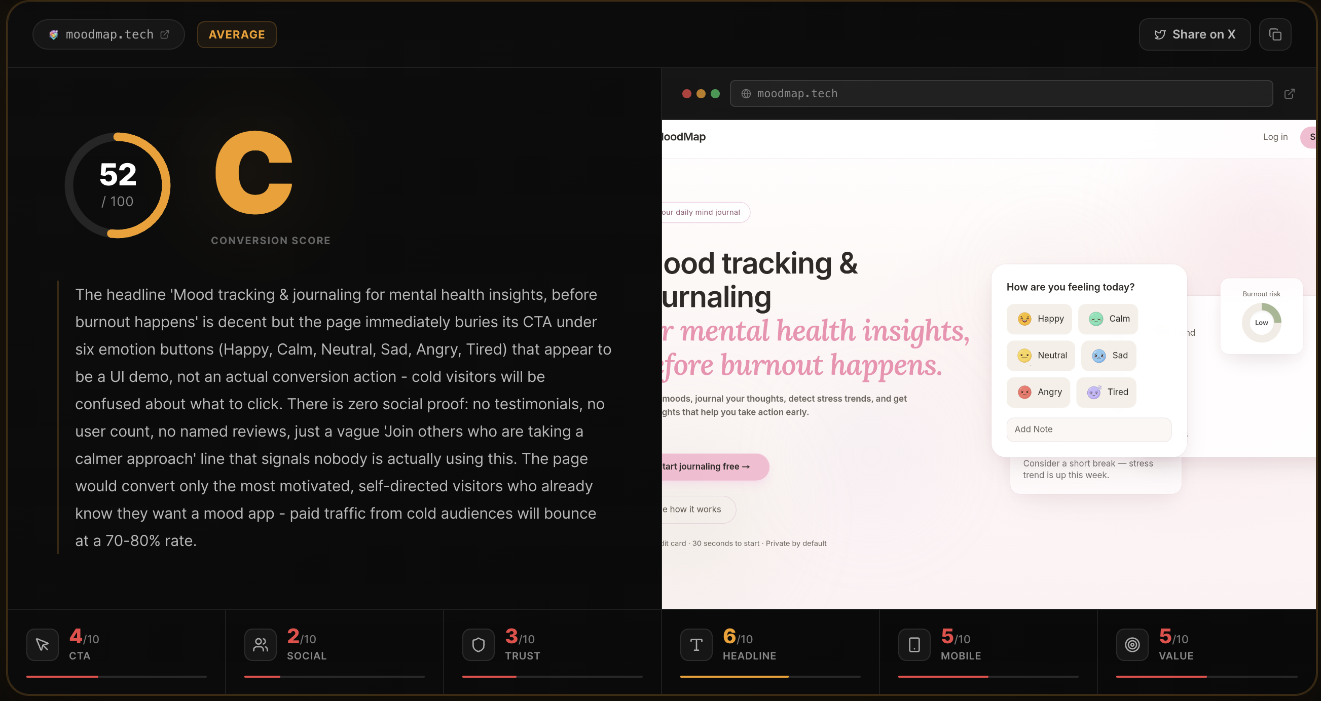
Fix these first
Ranked by conversion impactAdd a real user count or analyses-run counter directly under the H1, something like '4,200+ pages analyzed' or display a live counter. Right now the only social proof is three anonymous-looking testimonials with no photos or verifiable handles. Place this number in the hero section, between the subheadline and the CTA button, in a muted but visible font. This single change addresses the biggest trust gap for cold traffic and takes under 30 minutes to add.
Replace the three testimonials with versions that include real profile photos, full Twitter/X handles as clickable links, and the actual score improvement (e.g. 'went from 54 to 71'). The score-improvement story is already in the copy - make it visual with a before/after score badge next to each testimonial. Unverifiable initials like 'A Alex R. @alexr_builds' read as fake. If real users exist, get their permission to use a real photo and link. If not, remove the section entirely and replace with a 'Be the first to share your score' prompt.
Add a money-back guarantee or explicit risk-reversal statement near the '$29/mo' Pro CTA. The current upgrade button 'Go Pro - $29/mo - Unlimited Analyses' has no friction reducer next to it. Add one line directly below it: 'Cancel anytime. No questions asked.' This costs nothing to implement and directly addresses the hesitation point at the moment of purchase decision.
Category breakdown
The primary CTA 'Analyze my page free' is clear, action-oriented, and benefit-forward. The supporting microcopy 'Free for your first analysis - No signup required - Results in ~10s' directly addresses the three biggest objections (cost, friction, time). The CTA appears twice which is appropriate for page length. The secondary CTA 'Go Pro - $29/mo - Unlimited Analyses' is functional but cold - it reads like a pricing table row, not a conversion moment. The 'How does it work?' CTA is a distraction that competes with the primary action.
This is the most critical failure on the page. There are no customer logos, no star ratings, no user count, and no verified testimonials. The three testimonials present ('Alex R. @alexr_builds', 'Priya S. @priyaships') use initials, no photos, and unverifiable handles. The social proof section header 'What founders say' followed by these testimonials will read as fabricated to any skeptical cold visitor. The only real-time signal is the small 'notion.so was just analyzed' ticker in the nav, which is a smart touch but easy to miss.
The trust picture is weak for cold paid traffic. There is no money-back guarantee, no security or privacy badge near the form, no company information beyond a single founder name in the footer ('Rohan Gotwal'), no press mentions, and no verifiable user count. The footer with just 'Privacy | Terms | Rohan Gotwal' signals a solo side project, which is fine for warm audiences but will cause cold visitors to hesitate before entering their URL or paying $29. The free-first model reduces some friction, but the upgrade path has no trust scaffolding.
The H1 reads 'Your landing page has a conversion problem' - this is punchy and creates a pain-point hook, but it tells the visitor nothing about what the product IS or does. A cold visitor from a paid ad who has never heard of this tool could read that headline and still not know if this is a consulting service, a course, a plugin, or an AI tool. The subheadline 'You're sending traffic to a page that doesn't convert. Find out exactly why. In 10 seconds, free.' rescues it somewhat, but the H1 alone fails the 3-second test for product clarity.
The page structure suggests reasonable mobile compatibility - single column layout, short hero copy, and a prominent CTA. However, the H1 has a rendering artifact in the scraped data ('Your landing pagehas a conversion problem') suggesting a line-break or spacing issue that may display incorrectly on mobile. The nav has 6 items (Features, How it works, Pricing, FAQ, Blog, Contact) which will likely collapse into a hamburger menu - acceptable but the Blog and Contact links add clutter that dilutes focus. The animated scorecard visual in the hero may not render well at small sizes.
The value prop is actually one of the stronger elements here. The copy 'Most pages have 2-3 fixable issues killing 40-60% of potential signups. This tool finds them in 10 seconds. No vague advice, just verdicts and fixes you can act on today.' is specific, outcome-focused, and differentiated from generic audit tools. The 6-area breakdown is well-explained. The weakness is that the differentiation angle - 'no vague advice' - is stated but not proven until the testimonials, which are buried below the fold.