
Social preview
How it looks when shared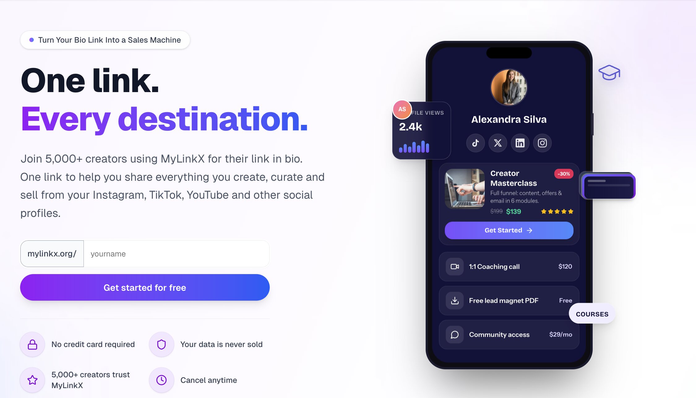
Fix these first
Ranked by conversion impactAdd at least 3 real named testimonials with photos, creator handle, and a specific result (e.g. 'I went from 200 clicks to 1,400 clicks in my first month - @kanisshka, Solopreneur'). Place them immediately below the hero section, before the 'How it works' block. Right now the page has zero human validation and cold traffic will not convert without it.
The '5,000+ creators trust MyLinkX' claim appears twice in the hero but has no supporting evidence. Replace one instance with a real number tied to a specific outcome, such as '$2.1M in creator revenue processed' or '5,000+ creators - 14M+ clicks tracked.' Add a row of 5-6 real creator profile thumbnails or logos beneath it to make the number feel real instead of made-up.
The claim 'Increase conversions by 40%' appears mid-page with no source, no context, and no proof. Either remove it entirely or replace it with a specific mini case study: 'Creator X switched from Linktree and saw 40% more clicks in 30 days - here is how.' Unsubstantiated percentage claims actively erode trust with skeptical cold visitors.
Category breakdown
The primary CTA 'Get started for free' is benefit-framed and low-friction, and the supporting copy 'No credit card required' reduces anxiety. However, the CTA appears at least twice in the hero area alone and the button text is identical each time, which dilutes urgency. There is no secondary CTA for visitors who are not ready to sign up (e.g. 'See a live example' or 'Watch a 60-second demo'). The pricing section exists but the CTA flow from pricing to signup is unclear from the scraped data.
This is the single biggest conversion killer on the page. There are zero testimonials, zero named case studies, zero customer logos, and zero star ratings. The '5,000+ creators trust MyLinkX' claim appears twice but is completely unverified - no faces, no names, no handles, no results. The demo profile 'Kanisshka' with '14.2K clicks, 8.4% CTR, 340 sales' is presented as a product mockup, not a real testimonial, so it reads as fabricated. Cold traffic from paid ads will not convert without human validation.
The page mentions 'Your data is never sold' and 'Cancel anytime' which are minimal but present. There is a security mention per the scrape. However, there is no money-back guarantee, no pricing transparency in the hero, no founder story, no press mentions, no company age or location, and no visible security badges (SSL, SOC2, etc.). For a tool asking creators to route their audience traffic and potentially process sales through it, the trust bar needs to be much higher.
'Turn Your Bio Link Into a Sales Machine' is clear, benefit-oriented, and speaks directly to the creator monetization pain point. A cold visitor understands within 3 seconds that this is a link-in-bio tool focused on revenue, not just link aggregation. The subheadline 'One link to help you share everything you create, curate and sell from your Instagram, TikTok, YouTube and other social profiles' adds useful context. The weakness is that it does not differentiate from Linktree, Beacons, or Stan Store - it sounds like every other tool in this space.
The page claims 'Mobile-First' and 'Loads in under 1 second' which are positive signals. The scrolling feature ticker (Real-time analytics, Setup in 2 minutes, etc.) is a common mobile-friendly pattern. However, the hero section has a lot of stacked elements - headline, subheadline, two trust badges, CTA, and a product mockup - which on mobile could push the CTA below the fold. The JS-rendered nature of the page also raises concerns about actual load time on mobile networks.
The page lists strong features - 0% transaction fees, custom domain, email capture, real-time analytics - but buries them in a scrolling ticker and feature grid rather than leading with the outcome. The problem/solution section ('Stop Losing Money on Every Click') is the strongest value prop on the page but it appears too far down. The promised outcome is 'earn more from your existing audience' but it is never quantified or proven with a real example.