
Social preview
How it looks when shared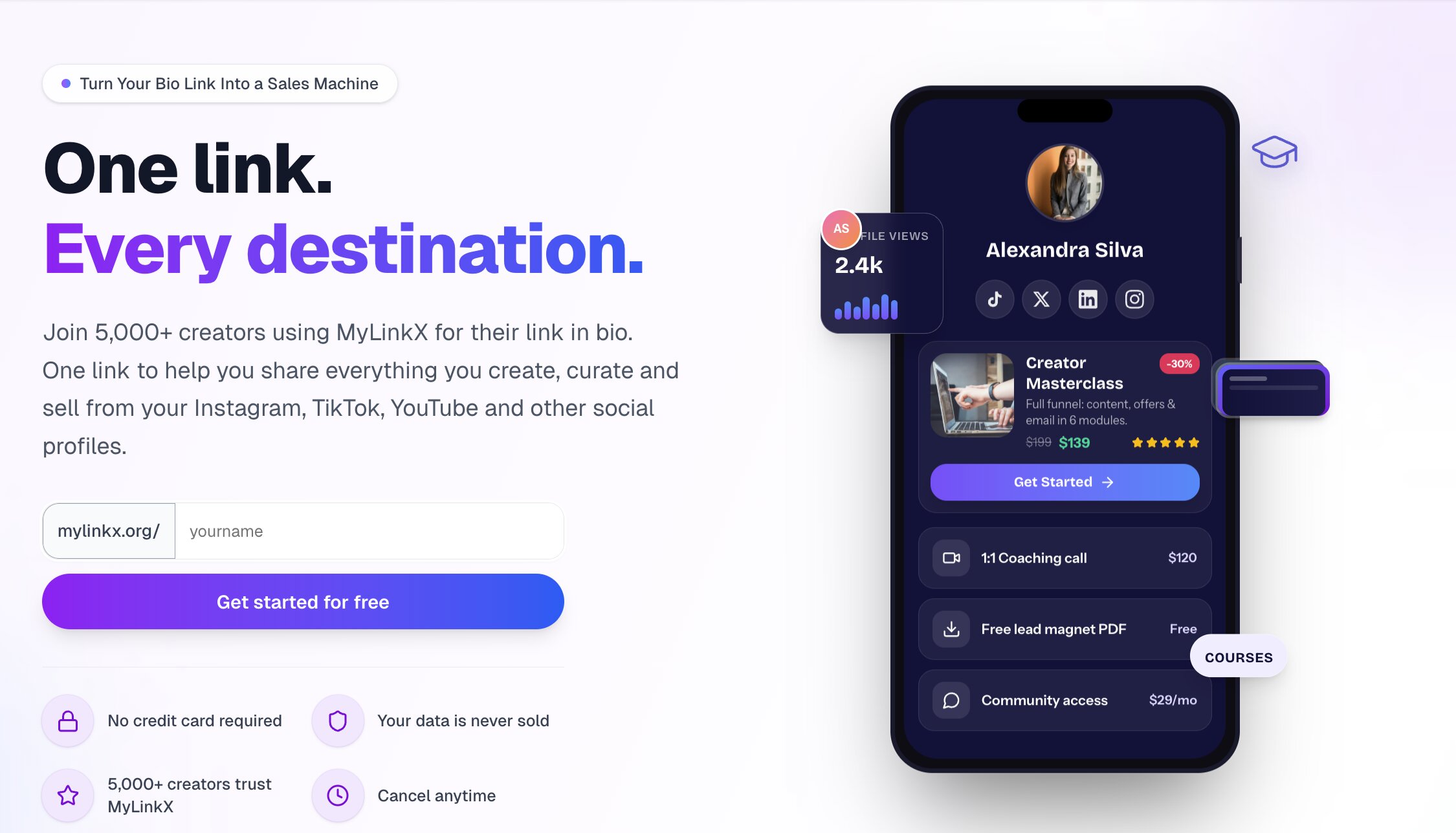
Fix these first
Ranked by conversion impactAdd 3 named testimonials with real photos, creator handle, and a specific result (e.g. '@janedoe went from 200 clicks/month to 1,400 and made her first $3k in sales in 30 days'). Place these immediately below the hero section, before the feature list. Right now the page has zero human validation and cold traffic will not convert without it.
Replace the scrolling feature ticker ('Real-time analytics, Setup in 2 minutes, Works on all platforms...') with a single bold outcome statement under the H1. Something like: 'Creators using MyLinkX earn an average of $X more per month from the same audience.' The ticker is invisible noise - it repeats three times and no one reads it.
Add a money-back guarantee or 'no credit card required' badge directly on or immediately below the primary CTA button in the hero. The text 'No credit card required' already exists in the page but it appears to be separated from the button - make it a visible sub-label directly under the CTA button so it reduces friction at the exact moment of decision.
Category breakdown
'Get started for free' is a safe, low-friction CTA and the 'No credit card required' qualifier reduces hesitation. However, the CTA appears to repeat in multiple places without a clear visual hierarchy - the hero CTA competes with a second 'Get Started' button inside the demo product card ($199 course). This creates confusion about what action the visitor is actually being asked to take. The primary CTA button color and size are not described but the page structure suggests it may not be visually dominant.
This is the page's fatal flaw for cold traffic. The only social proof is '5,000+ creators trust MyLinkX' repeated twice with no names, no faces, no logos, and no results. The demo profile 'Kanisshka - Solopreneur, Founder, Creator' with '14.2K CLICKS, 8.4% CTR, 340 SALES' is a mockup, not a real testimonial. There are no star ratings, no press mentions, no customer logos, and no named testimonials anywhere on the page.
The page mentions 'Your data is never sold' and 'Cancel anytime' which are positive micro-trust signals. There is a pricing section which adds legitimacy. However, there is no money-back guarantee, no security badge (SSL, SOC2, etc.), no founder or team presence, no press mentions, and no company 'About' signal. The domain is mylinkx.org - the .org TLD for a commercial SaaS product may subtly undermine trust for skeptical visitors who expect .com.
'Turn Your Bio Link Into a Sales Machine' is clear and benefit-oriented. A cold visitor understands within 3 seconds that this is a link-in-bio tool focused on monetization. The subheadline 'One link to help you share everything you create, curate and sell from your Instagram, TikTok, YouTube' adds useful context. It works, but 'Sales Machine' is a claim that needs immediate proof to land - without it, it reads like marketing fluff.
The page claims 'Mobile-First' design and '90% of bio link clicks happen on mobile' which suggests the team is aware of mobile importance. The 'Setup in 2 minutes' and 'Loads in under 1 second' claims are positive signals. However, the scrolling feature ticker with 7 items repeating three times is likely a poor mobile experience - it may be hard to read and adds scroll depth without adding value. The demo product card with pricing ($199, $139, $120, $29/mo) may render as a cluttered block on small screens.
The page lists strong differentiators - 0% transaction fees, custom domain included, email capture built-in, unlimited links free - but these are buried in a scrolling ticker that repeats three times and is easy to ignore. The 'Stop Losing Money on Every Click' section with the problem/solution framing is the strongest value prop on the page, but it appears too far down. The '40% conversion increase' claim appears with no source or context, which makes it feel fabricated.