Social preview
How it looks when shared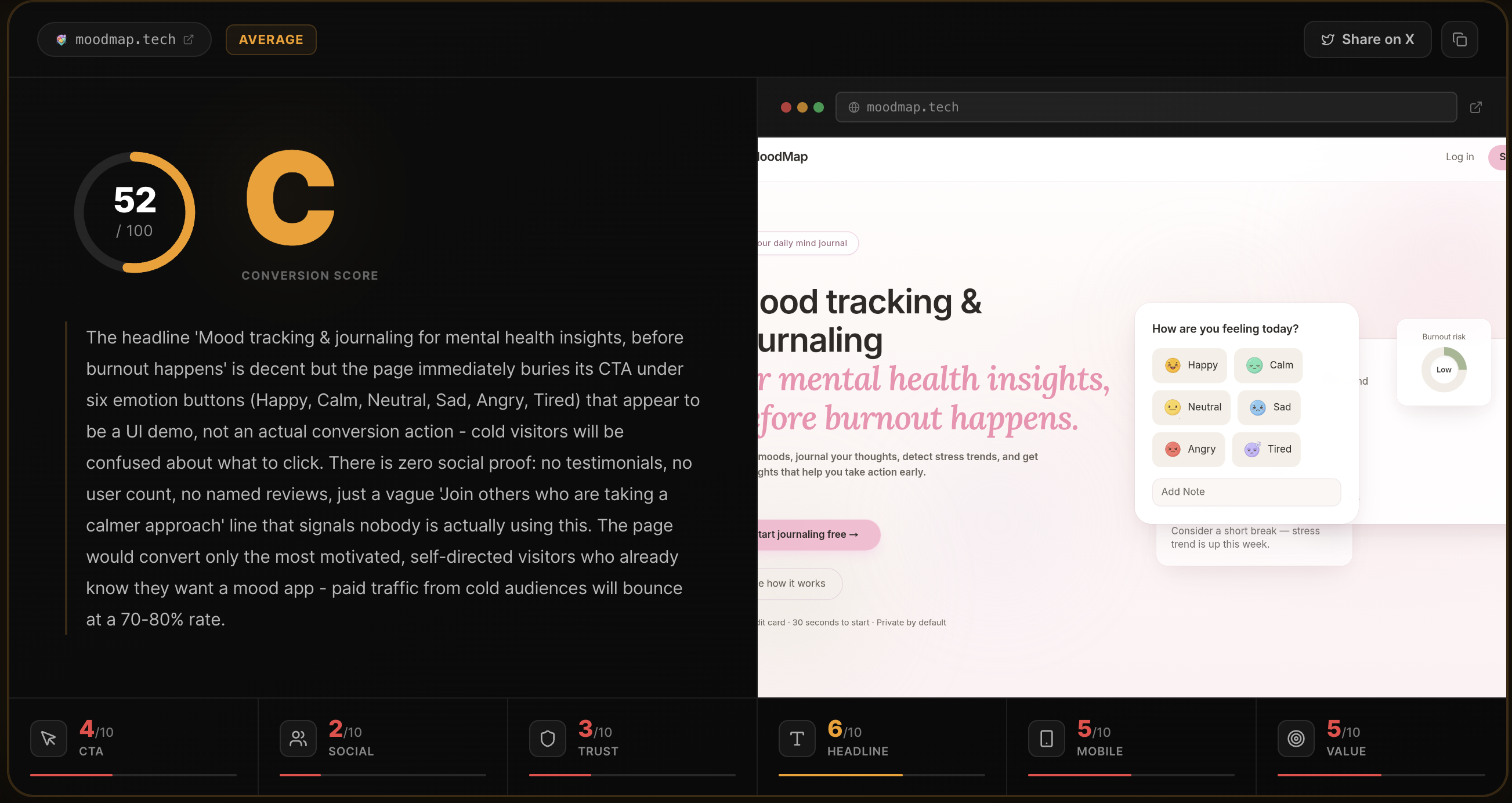
Fix these first
Ranked by conversion impactAdd a live counter or static number above the fold showing how many pages have been analyzed, e.g. 'Join 1,200+ founders who have already analyzed their page' placed directly under the H1. If you have zero data, run 50 free analyses on real Indie Hackers pages, collect one-line quotes, and paste 3 of them as testimonials with name and Twitter handle directly above the first CTA button. No social proof on a tool that sells credibility is a fatal mismatch.
Add a sample scorecard result visible on the page without clicking anything. Show a real or realistic example output - the score, grade, roast summary, and one category breakdown - as a static screenshot or live embed below the 'How it works' section. Visitors cannot evaluate what they are buying if they have never seen the output format. This single change removes the biggest unknown that causes bounce.
Replace the footer credit '@Rohan27s on X' with a minimal founder block in the footer or about section: a real name, a one-line bio ('I built this after wasting $3k on ads to a broken landing page'), and a face photo. Anonymous tools with no human behind them fail the trust sniff test for cold traffic. Takes 20 minutes to add and meaningfully changes perceived legitimacy.
Category breakdown
The primary CTA 'Analyze my page free' is clear, benefit-forward, and repeated at logical scroll points. The micro-copy underneath - 'Free for your first analysis - No signup required - Results in ~10 seconds' - is excellent friction reduction that directly addresses the three most common objections. The 'Unlock unlimited analyses' CTA for the Pro plan is weaker and generic. The nav also lists 'Features | How it works | Pricing | FAQ | Contact' which adds cognitive load before the visitor even reads the hero.
There is no social proof of any kind on this page. No testimonials, no user count, no logos, no star ratings, no press mentions, no case studies, no named users. For a tool that is literally selling its ability to make people trust YOUR page, the irony of having zero trust signals on its own page is a conversion killer. A cold visitor has no evidence this tool has ever helped a single person.
The page has a pricing section (good), mentions free tier with no signup (good), and has Privacy/Terms links (baseline). Everything else is missing: no money-back guarantee on the $29/mo plan, no security mention, no company name or legal entity, no founder identity beyond a Twitter handle in the footer, zero images or screenshots of the actual product output. The footer '@Rohan27s on X' as the only human signal actively undermines trust for cold traffic who do not know Rohan.
'Getting traffic but not enough signups?' immediately resonates with the exact pain of the target user - founders running paid traffic. The subheadline 'Paste your URL. Get a brutal honest conversion score across 6 dimensions with specific fixes ranked by impact.' clearly explains what the product does. The '~10 seconds, free, no signup' trio below the CTA is excellent friction reduction. Loses points because 'brutal honest conversion score' is slightly vague - a cold visitor does not instantly know if this is a human review, a checklist tool, or an AI audit.
The page structure - single column flow, short hero text, prominent CTA, step-by-step how it works - is inherently mobile-friendly in layout. There are no images to break, no complex tables, and the form is a single URL input. However, the navigation bar with 6 items (Features, How it works, Pricing, FAQ, Contact, plus the logo) will likely compress poorly on small screens and may push the hero CTA below the fold. The zero-image approach means no visual anchor on mobile to hold attention past the headline.
The page correctly leads with outcome ('fix your conversion') rather than features, and the five output types are clearly listed. 'Verdicts + fixes - not vibes' is a genuinely good differentiator line. However, the page never quantifies the outcome - there is no claim like 'founders who fix their top 3 issues see X% lift' or even a directional promise. The value prop is clear on WHAT you get but silent on WHY it matters more than a free Hotjar heatmap or asking a friend.