Social preview
How it looks when shared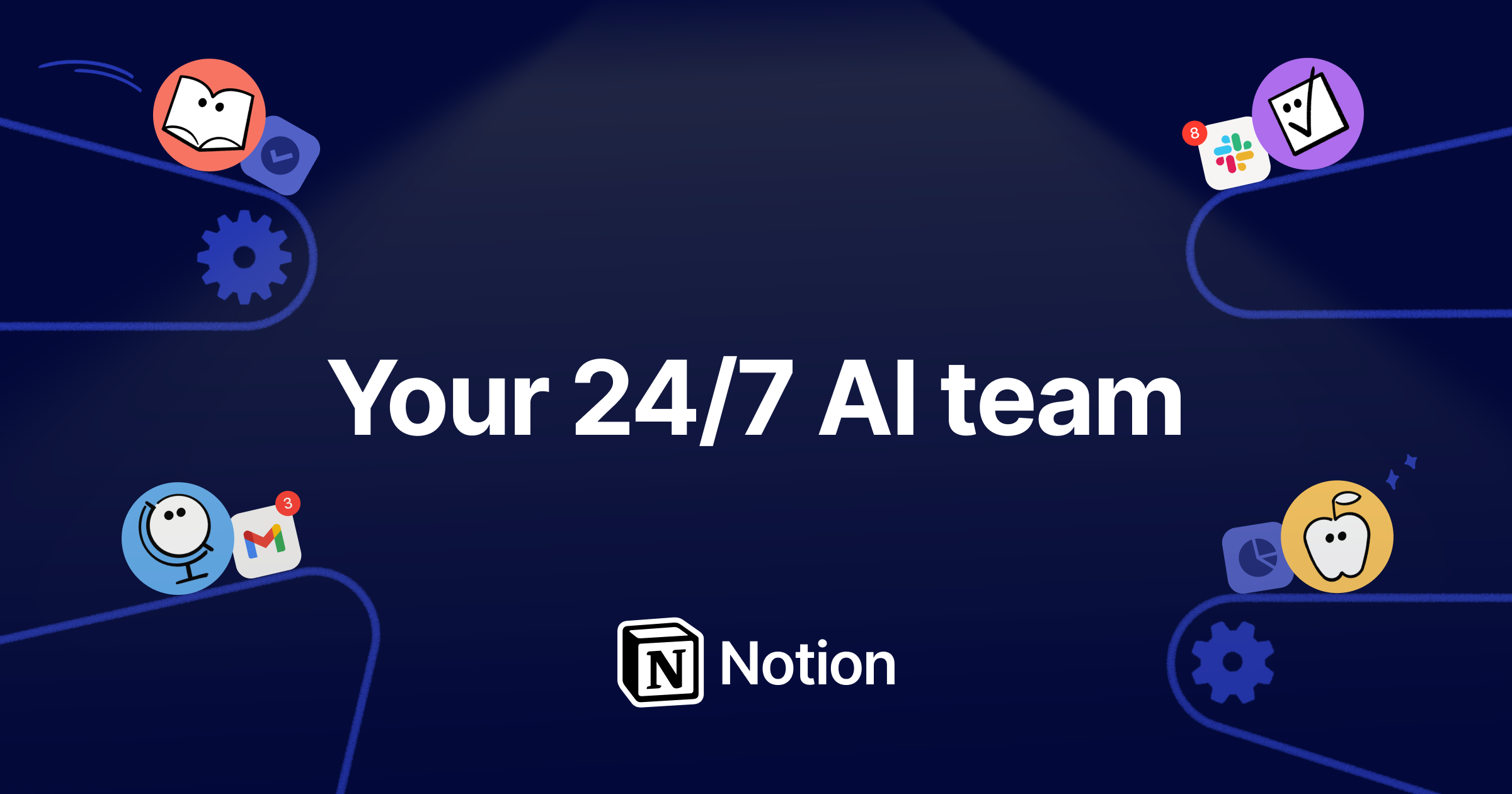
Fix these first
Ranked by conversion impactReplace the H1 'Pause' (a render artifact) with the actual value proposition headline. The copy 'Your AI everything app' exists on the page but is buried. Move it to H1 position with a supporting subheadline like 'One workspace for docs, projects, wikis, and AI agents - replace 5+ tools for one price.' This single fix stops the 5-second bounce for cold traffic who currently see nothing meaningful above the fold.
Add a single primary CTA button above the fold with specific friction-reducing copy. 'Try for free' exists but appears near the bottom of the scraped content. Place a high-contrast 'Try Notion Free - No credit card required' button immediately below the hero headline. The current page buries the free trial offer, which is your strongest conversion lever.
The savings calculator ('Calculate savings below') is a powerful conversion tool but is referenced with no anchor or visual prominence. Add a sticky or early-page callout that says 'See how much your team saves vs. 12 separate tools' with a direct jump link to the calculator. This turns a passive feature into an active conversion driver for cost-conscious buyers.
Category breakdown
The primary CTA 'Try for free' and 'Get started on Notion' appear near the bottom of the page content based on the scrape order, suggesting they are not prominently above the fold. There are also multiple competing CTAs: 'See pricing plans', 'Download for Mac', 'Download Notion Mail', 'Download Notion Calendar', and 'Get started on Notion' - this is CTA fragmentation that splits attention and reduces conversion. A cold visitor does not know whether to try the web app, download the Mac app, or download Notion Mail.
The social proof inventory is actually strong: 100M users worldwide, Forbes Cloud 100 trusted by 98%, 62% of Fortune 100, 50%+ of YC companies, 1.4M community members, four G2 number-one rankings, and customer quote snippets from named companies like Ramp. The main gap is that named testimonials with faces and titles are absent from the scraped content, and the customer logos section exists but no specific logos are named. The social proof stats appear to be in a scrolling ticker format, which reduces their impact versus static, prominent placement.
Pricing transparency exists (the tool cost comparison table is a strong trust builder). Free trial is mentioned. The Forbes Cloud 100 and Fortune 100 stats lend enterprise credibility. However, there is no money-back guarantee mentioned, no security or compliance badges (SOC 2, GDPR, etc.) visible in the scrape, and no founder or team presence. For enterprise buyers evaluating a tool that will hold all their company knowledge, the absence of security signals is a meaningful trust gap.
The extracted H1 is 'Pause' - this is almost certainly a JavaScript loading state that was captured mid-render, not an intentional headline. A cold visitor landing on a page where the first word they read is 'Pause' has zero context for what Notion does. Even if the real headline loads correctly in-browser, the fact that the render captured this suggests a meaningful percentage of real visitors on slow connections or ad click-throughs may experience this broken state. The actual positioning copy ('Your AI everything app. More productivity. Fewer tools.') is strong but appears mid-page.
The page structure raises mobile concerns. The savings calculator with a multi-column tool comparison grid (12 tools listed with per-user pricing) will almost certainly render poorly on mobile screens. The scrolling ticker for social proof stats is a common mobile performance issue. The multiple download CTAs (Mac app, Notion Mail, Notion Calendar) are desktop-oriented and create confusion for mobile visitors who may not be on a Mac. The hero section's conversion path is unclear on mobile if the primary CTA is buried below agent feature descriptions.
The value prop exists but is scattered. 'Your AI everything app. More productivity. Fewer tools.' is genuinely compelling positioning, and the savings calculator showing $340/month saved per user is a concrete, differentiated proof point. However, the page leads with agent feature categories (Q&A agents, Task routing agents, Reporting agents) before establishing what Notion fundamentally is. A cold visitor who doesn't already know Notion will be confused about whether this is an AI tool, a project manager, or a wiki before they ever reach the value prop.