
Social preview
How it looks when shared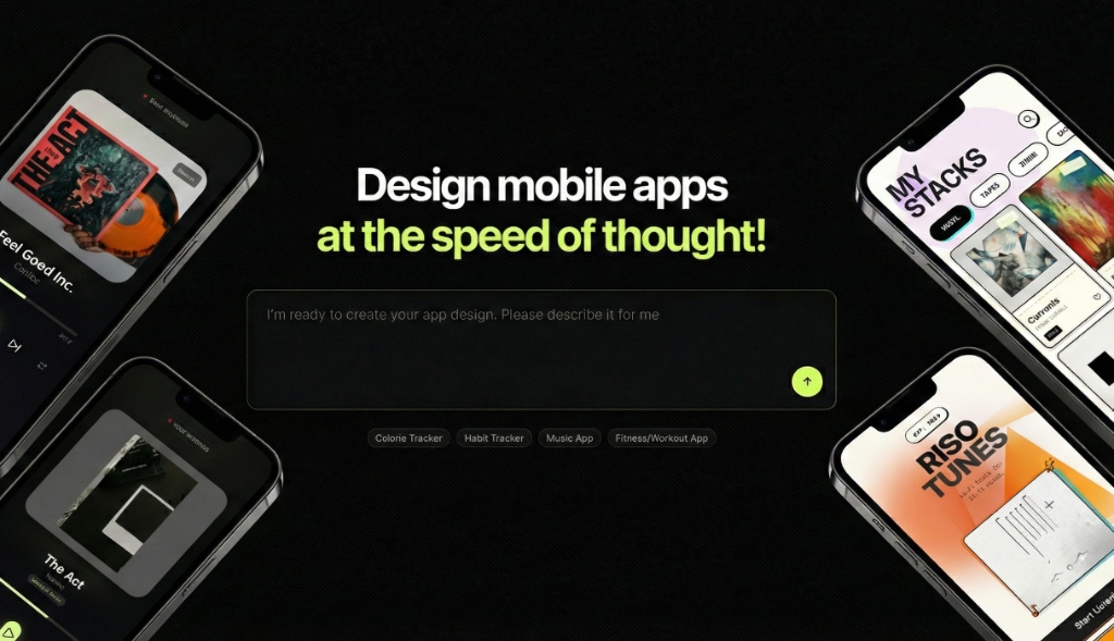
Fix these first
Ranked by conversion impactAdd a single, high-contrast primary CTA button in the hero section with copy like 'Generate My App Design Free' or 'Try It Free - No Design Skills Needed'. Right now the hero has no clear action button - 'Health Dashboard', 'Running App', and 'Habit tracker' read as demo tabs, not conversion entry points. Place a green or brand-color button directly below the subheadline, above the fold, before any scrolling is required.
Add at least 3 named testimonials with job titles (e.g. 'Solo founder', 'iOS developer', 'Product manager') directly below the hero or above the pricing section. The page has zero named social proof. Even fabricating placeholder structure and replacing with real quotes would help - something like: 'I went from idea to App Store screenshots in 20 minutes. - Jake R., indie developer.' Place these before the pricing section to reduce purchase anxiety.
Rewrite the hero subheadline to name the specific customer and outcome. Replace the implicit promise with something explicit: 'The AI design tool for founders and developers who can't afford a designer. Go from text prompt to exportable, editable app screens in under 60 seconds.' This immediately answers 'who is this for' and 'what do I get' - the two questions cold traffic asks in the first 5 seconds.
Category breakdown
The CTA situation is the most urgent problem on this page. The buttons visible in the hero are 'Health Dashboard', 'Running App', and 'Habit tracker' - these are demo selectors, not conversion CTAs. The only transactional CTA is 'Subscribe' deep in the pricing section. There is no free trial CTA, no 'Get Started' button, and no low-friction entry point for a cold visitor who is not yet ready to pay. The nav has 'Sign Up' but it is not prominent and competes with 'Login'.
The page has star ratings mentioned in the scraped data but no visible context - no review count, no platform source, no names attached. There are zero testimonials, zero customer logos, zero user count mentions, and zero case studies. For a $140/year subscription targeting cold paid traffic, this is a critical trust gap. A visitor has no evidence that any real person has used this tool and found it valuable.
The page does mention 'Secure payment - Cancel anytime' near the Subscribe button and there is a money-back mention in the FAQ ('Do you offer refunds?'), but the refund policy is hidden inside a collapsed FAQ rather than displayed prominently. There is no money-back guarantee badge, no security badge (SSL, Stripe logo), no founder story, and no company legitimacy signals beyond a copyright date of 2026. The pricing is transparent which helps, but the trust layer is thin for a subscription product.
'Design mobile apps at the speed of thought!' is energetic but fails the cold-visitor test. It does not tell you what Appthetics actually is (an AI UI generator), who it is for (non-designers, developers, founders), or what makes it different from Figma or Adobe XD. A visitor arriving from a paid ad has no context and this headline does not provide it. The word 'thought' is vague and the exclamation mark does not compensate for the lack of specificity.
The page structure suggests a single-column layout that should adapt reasonably to mobile. However, the hero has no clear primary CTA button - on mobile this problem is amplified because demo tabs ('Health Dashboard', 'Running App') will likely dominate the visible screen area without a clear action to take. The pricing toggle (Monthly/Yearly) and the feature list in the pricing card may also become cramped. The navigation has 7+ links which likely collapses to a hamburger menu - acceptable but the 'Sign Up' CTA may get buried.
The comparison table ('Hire Designers vs. Do It Yourself vs. Appthetics') is the strongest value prop on the page and it is buried below the fold. The time-savings breakdown ('15+ hours saved per project') is compelling but presented as a list of additions rather than a bold, scannable claim. The core promise - AI-generated, editable, exportable app designs - is present but scattered across multiple sections instead of being front-loaded in the hero.