
Social preview
How it looks when shared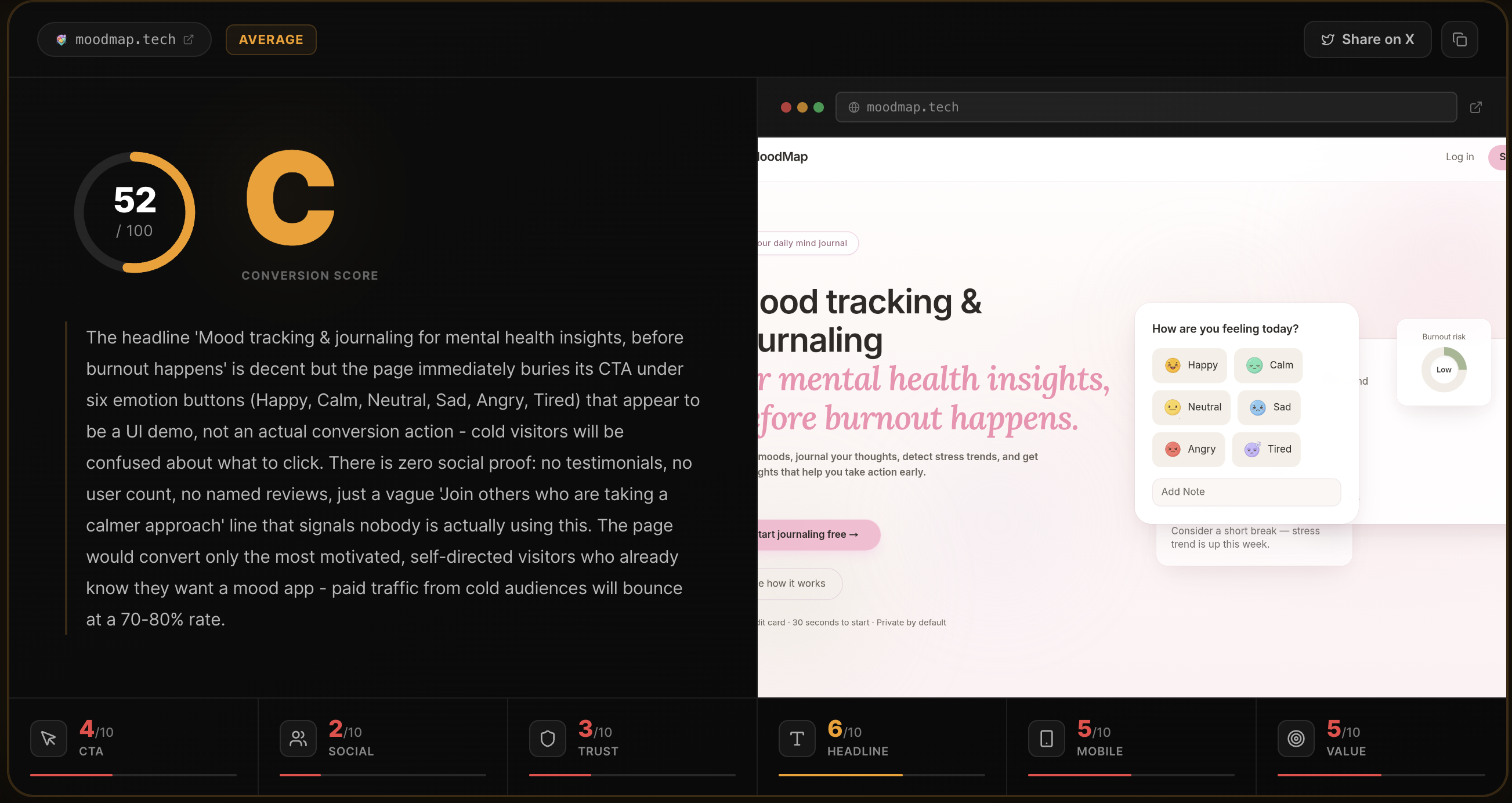
Fix these first
Ranked by conversion impactAdd a real user count or analyses-run counter directly under the H1, something like '4,200+ pages analyzed' or show a live/recent count. Right now the only social signal is a fake-feeling ticker ('notion.so was just analyzed') and three anonymous testimonials. A single credible number above the fold would do more for trust than all three testimonials combined. Place it between the subheadline and the CTA button.
The three testimonials need photos, real Twitter/X profile links, and ideally a visible follower count or handle that can be clicked and verified. Right now 'Alex R. @alexr_builds' and 'Priya S. @priyaships' are unverifiable and look AI-generated. Either replace them with real, linkable testimonials or remove the section entirely - fake-looking proof is worse than no proof.
Fix the broken H1 rendering: 'Your landing pagehas a conversion problem' is missing a space between 'page' and 'has' - this appears in the scraped text and likely renders on mobile. A typo in the hero headline destroys credibility instantly for a tool that is supposed to audit landing pages for quality. Fix the whitespace and also rewrite the subheadline to name the product category explicitly, e.g. 'MyPageFeedback is an AI conversion auditor - paste your URL and get a 0-100 score with exact fixes in 10 seconds.'
Category breakdown
The primary CTA 'Analyze my page free' is clear, benefit-oriented, and low-friction - no signup required is called out directly beneath it. The CTA appears twice on the page which is appropriate. The supporting microcopy 'Free for your first analysis - No signup required - Results in ~10s' directly addresses the three main objections (cost, friction, time). The secondary CTA 'Go Pro - $29/mo - Unlimited Analyses' is clean and transparent. The main weakness is that the input form (URL field) is not visible in the scraped text as a prominent above-the-fold element - if the visitor has to scroll to find where to paste their URL, that adds friction.
There are zero verified trust signals. No customer logos, no user count, no star ratings, no press mentions. The three testimonials ('Alex R. @alexr_builds', 'Priya S. @priyaships', and a truncated third) have no photos, no clickable profile links, and use casual lowercase writing that reads as fabricated. The 'notion.so was just analyzed' ticker is a weak substitute for real social proof and could be hardcoded. This is the single biggest conversion killer on the page for cold paid traffic.
The page has no money-back guarantee, no security badge, no SSL mention, no company information beyond a footer credit to 'Rohan Gotwal', and no pricing transparency for what happens after the free run until the pricing section. There is no 'About' or founder story. For a tool asking users to submit their URLs (which reveals their business), the absence of any privacy or data handling statement above the fold is a concern. The free tier reduces financial risk but does not address data trust.
The H1 reads 'Your landing pagehas a conversion problem' - there is a missing space that likely renders as a typo on screen, which is a credibility-destroying error for a landing page quality tool. Beyond the typo, the headline is a problem-statement hook, not a product description. A cold visitor from a paid ad does not yet know this is an AI audit tool - they just know they supposedly have a problem. The subheadline 'You're sending traffic to a page that doesn't convert. Find out exactly why. In 10 seconds, free.' is better and does more work, but it is below the fold on mobile.
The page structure suggests a standard single-column layout that should adapt to mobile, but the broken H1 spacing ('pagehas') is a red flag for rendering issues. The navigation includes 5 links (Features, How it works, Pricing, FAQ, Contact) which on mobile likely collapses into a hamburger or wraps awkwardly. The animated scorecard preview image may not communicate its value on a small screen. The hero microcopy ('Free for your first analysis - No signup required - Results in ~10s') is three separate items that may stack poorly on narrow screens.
The page does communicate a clear outcome - a 0-100 score, letter grade, and top 3 fixes - and the '10 seconds, free' angle is a strong hook. The feature list (Conversion Score, Social Preview Check, Top 3 Fixes, 6-Area Breakdown, Shareable Scorecard) is well-structured. However, the differentiation from competitors like Unbounce's analyzer or manual CRO audits is never stated. The copy 'No vague advice, just verdicts and fixes you can act on today' is the strongest value prop line on the page and it is buried in the body, not in the hero.