
Social preview
How it looks when shared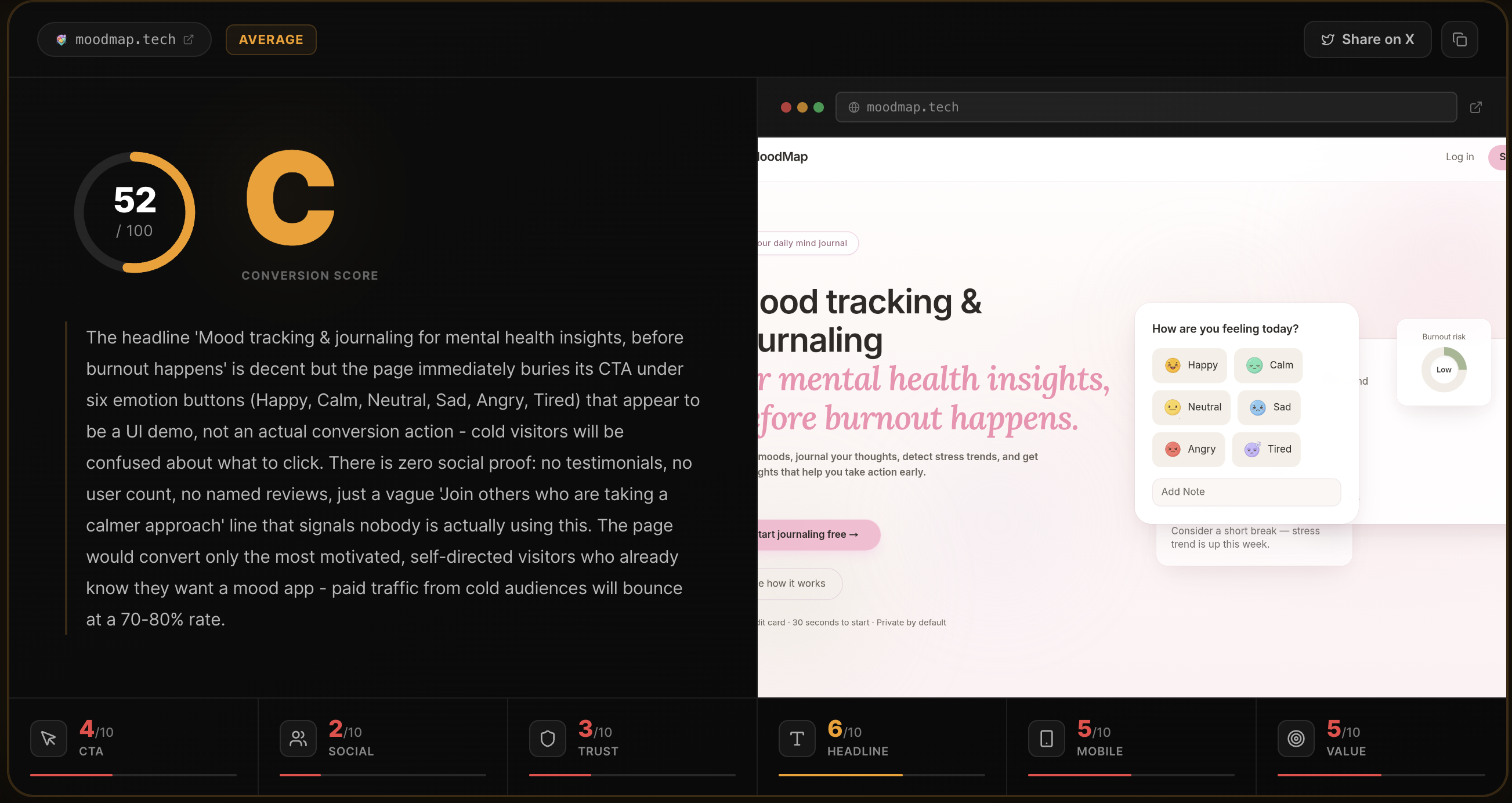
Fix these first
Ranked by conversion impactReplace the fake-looking testimonials with at least 3 real ones that include a profile photo, full name, company or product name, and a specific before/after metric. The current testimonials ('Alex R. @alexr_builds') look fabricated. Even one real screenshot of a tweet or Indie Hackers post embedded above the fold would outperform all three current testimonials combined. Place one real testimonial directly below the hero CTA button.
Add a live counter or cumulative stat in the hero section - something like '4,200 pages analyzed' or 'Used by 1,800+ founders' - directly below the CTA button where it currently says 'Free for your first analysis - No signup required - Results in ~10s'. If you have real usage data, show it. If not, even showing the number of analyses run today (pulled dynamically) builds instant credibility. The '52/100 notion.so was just analyzed' ticker is a good instinct but it disappears in the nav and needs to be bigger and more prominent.
Add a no-questions-asked satisfaction note near the Pro plan CTA. The 'Go Pro - $29/mo - Unlimited Analyses' button has zero risk reversal around it. Add one line directly below it: 'Not useful? Email us for a full refund within 7 days.' This removes the last objection for anyone considering upgrading after their free run.
Category breakdown
The primary CTA 'Analyze my page free' is benefit-clear, low-friction, and repeated appropriately. The supporting microcopy 'Free for your first analysis - No signup required - Results in ~10s' directly addresses the three biggest objections (cost, effort, time) in one line - this is well done. The secondary CTA 'Go Pro - $29/mo - Unlimited Analyses' is clear on price and benefit. The FAQ CTAs 'How does it work?' and 'Is it really free?' are good for handling objections inline. The main weakness is that there is no urgency or scarcity element, and the Pro upgrade path has no risk reversal.
This is the single biggest conversion killer on the page. The 'What founders say' section has three testimonials that are structurally weak: initials instead of full names ('Alex R.', 'Priya S.'), no profile photos, no company or product names, and no verifiable links. The Twitter handles (@alexr_builds, @priyaships) are not linked, so a skeptical visitor cannot verify them. There are no customer logos, no user count, no press mentions, no star ratings, and no case studies. The live ticker showing 'notion.so was just analyzed' is a clever trust signal but it is buried in the nav bar where most visitors will not notice it.
A skeptical first-time visitor would find very little to trust here. There is no money-back guarantee, no security badge, no SSL mention, no company information beyond a footer credit to 'Rohan Gotwal', no team page, no about section, and no press mentions. The pricing section exists which is a positive signal, but $29/mo with no refund policy and no company legitimacy signals is a hard sell to cold traffic. The footer with just 'Privacy | Terms | Rohan Gotwal' is minimal to the point of feeling unfinished.
The H1 'Your landing page has a conversion problem' is punchy and creates immediate relevance for the target audience - founders running paid traffic. However, it tells the visitor what their problem is without immediately telling them what the product does to solve it. A cold visitor who has never heard of this tool needs 3 seconds to understand: what is this, what does it do, and why should I care? The subheadline 'You're sending traffic to a page that doesn't convert. Find out exactly why. In 10 seconds, free.' does the heavy lifting but it is below the fold on mobile. The headline also has a rendering artifact - 'Your landing pagehas a conversion problem' shows no space between 'page' and 'has', which looks broken and unprofessional.
The page structure - single column, clear CTA, short feature cards - is generally mobile-friendly. However, the H1 rendering bug ('Your landing pagehas a conversion problem') likely appears as a broken line break on mobile. The nav bar with 5 links (Features, How it works, Pricing, FAQ, Contact) will collapse into a hamburger or overflow on small screens, potentially hiding the live ticker. The product screenshot showing the scorecard UI is a single image - if it is not responsive, it may render too small to read on mobile. The three-step 'How it works' section with numbered steps should work well on mobile.
The value prop is actually one of the stronger elements here. 'Most pages have 2-3 fixable issues killing 40-60% of potential signups. This tool finds them in 10 seconds.' is specific, credible, and outcome-focused. The 6-area breakdown feature list is well-structured and avoids vague language. The 'Shareable Scorecard' angle targeting build-in-public and Indie Hackers communities is a smart distribution hook. The weakness is that none of these claims are anchored to real data or customer outcomes - they read as assertions rather than proven results.