Social preview
How it looks when shared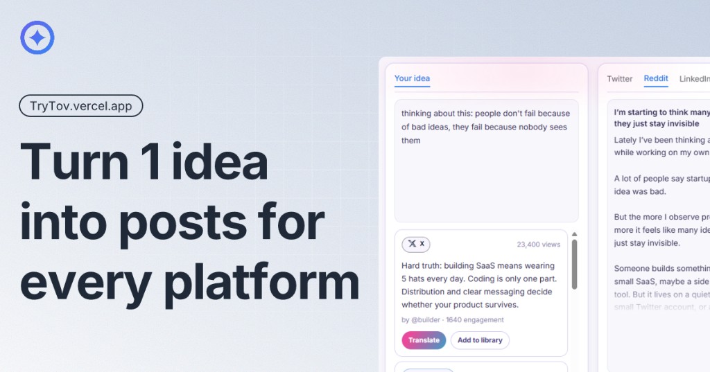
Fix these first
Ranked by conversion impactReplace the H1 'Built for solo founders' with a benefit-first headline that names the product and the outcome. Example: 'Turn one idea into 5 platform-native posts in 30 seconds' - then use 'Built for solo founders' as a subheadline. This single change will immediately communicate what Tov does to a cold visitor before they read another word.
Collapse the dual CTA ('Try the translator or Join waitlist') into ONE primary action. Since the product has a live demo, make 'Try the translator' the only above-the-fold CTA button in a high-contrast color. Move 'Join waitlist' to a secondary text link below it. Splitting CTAs at the hero level is a proven conversion killer.
Add a single concrete social proof element directly below the hero CTA. Even one real quote from a beta user with their name and Twitter handle works. If you have zero users, add a number: 'X founders on the waitlist' or 'Used by founders from [company names]'. Right now there is nothing between the visitor and their skepticism.
Category breakdown
The primary CTA area reads 'Try the translator or Join waitlist' - this is two competing actions presented as a choice, which creates decision paralysis. The word 'or' is doing serious damage here. Below the hero, 'Lock early price' and 'Join the waitlist to lock $25/mo' appear in the pricing section. The page has at least 3 different CTA intents (try demo, join waitlist, lock price) with no clear hierarchy. The 'No credit card required' trust note is good but it is attached to the wrong CTA.
There is zero social proof on this page. No testimonials, no user count, no customer logos, no star ratings, no press mentions, no case studies. The only human signal is the founder's own bio section ('Hey, I am @odkii'). The demo shows fake engagement numbers (23,400 views, 12,800 views) which could actually backfire if visitors realize these are fabricated examples rather than real results.
The founder transparency ('Hey, I am @odkii', direct DM access, 'Founder replies in DM') is a genuine trust signal for the solo founder audience and is well-executed. The 'No credit card required' note helps. However, there is no money-back guarantee, no security mention, no pricing transparency on what the free plan actually includes, and the phrase 'Numbers vary week to week - ask me in DM for current waitlist' sounds uncertain and undermines confidence in the product's traction.
The H1 'Built for solo founders' is an audience label, not a value statement. A cold visitor landing here from a paid ad sees this and still has no idea what Tov does. The actual product description - 'Turn one post into native versions for X, LinkedIn, Facebook, Reddit, and Telegram' - is buried in the subheadline below. That sentence is the real headline and it is sitting in second position where most visitors will never read it.
The page is JS-rendered which suggests a modern framework that likely handles basic responsiveness. However, the interactive demo ('Translator demo - Try the workflow') with multiple platform tabs (X, Reddit, LinkedIn) is a complex UI element that often breaks or becomes unusable on mobile. The dual CTA in the hero ('Try the translator or Join waitlist') will likely stack awkwardly on small screens. The pricing comparison table with two columns may compress poorly on 375px screens.
The 'Google Translate for social platforms' analogy in the 'What Tov is' section is genuinely strong and memorable - it communicates the concept instantly. The pain points listed ('One idea. Too many rewrites', 'Copy-paste breaks momentum', 'Generic AI text sounds flat') are accurate and resonate with the target audience. However, this strong value prop is buried mid-page. The differentiation from generic AI tools like ChatGPT is implied but never stated directly, which is a missed opportunity given how crowded this space is.