
Social preview
How it looks when shared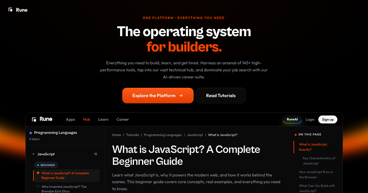
Fix these first
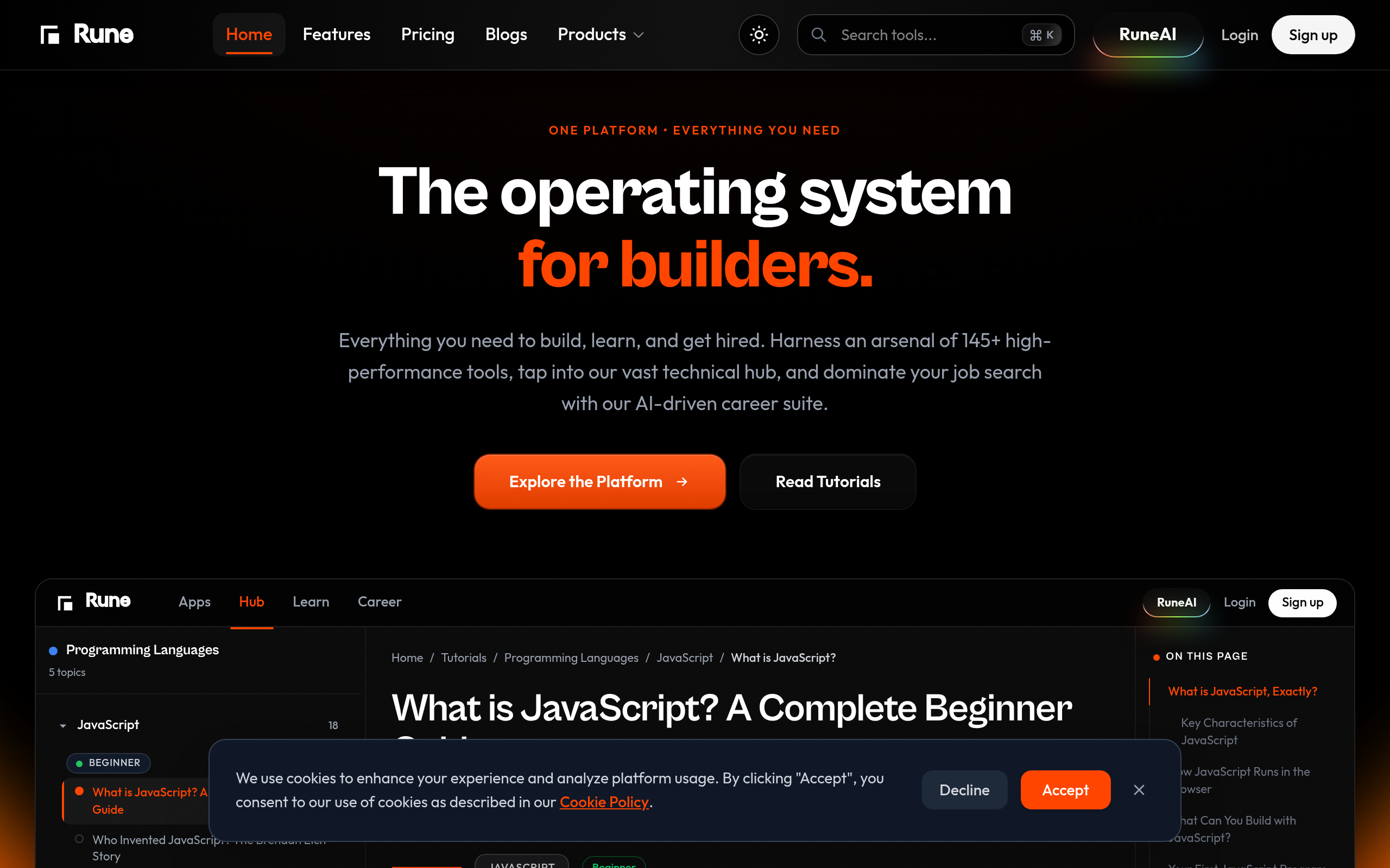
Ranked by conversion impactThe hero section is being cannibalized by a full JavaScript tutorial article rendering below it. Separate the homepage from the tutorial content entirely. The homepage hero needs to stay focused on one CTA - either 'Try the Tools Free' or 'Sign Up Free' - and the tutorial content should live at /tutorials/javascript/what-is-javascript, not on the root domain. Right now a cold visitor scrolls past the hero and immediately enters a 12-minute read with no conversion moment.
Rewrite the H1 from the vague 'The operating system for builders' to something that names the actual product category and outcome, for example: '145+ Free Browser Tools for Developers - No Signup Required' or 'Build Faster. Learn Smarter. Get Hired. One Platform for Developers.' Then add a subheadline that lists the three pillars in one sentence: 'Free PDF, image, and dev tools plus programming tutorials and an AI career suite - all in one place.'
The primary CTA buttons are 'Explore the Platform' and 'Read Tutorials' - both are low-commitment, direction-less actions that split visitor intent. Replace the primary CTA with a single high-contrast button that reads 'Try 145+ Free Tools - No Signup Needed' and remove or demote 'Read Tutorials' to a text link below it. One CTA, one decision, one conversion path.
Category breakdown
The two primary CTAs are 'Explore the Platform' and 'Read Tutorials' - both are passive, low-urgency, and split the visitor's attention. Neither communicates a benefit or reduces friction. The navigation also lists 'Products | Apps | Hub | Learn | Career | JavaScript18' as clickable elements, creating at least 8 competing directions for a cold visitor. The 'Sign up' button exists in the nav but is not the primary hero CTA. There is no free trial mention, no 'no credit card required' reassurance, and no urgency.
The scrape shows customer logos and star ratings exist somewhere on the page, but there are no named testimonials, no user count ('Join 50,000 developers'), no case studies, and no press mentions visible in the first 3,000 characters of content. The star ratings without names or review counts are nearly worthless for cold traffic - they look decorative. The customer logos are present but unverified as to placement or recognizability.
There is a pricing section and a security mention, which is a baseline. But there is no money-back guarantee, no free trial callout in the hero, no founder or team presence, no 'as seen in' press bar, and no visible security badges (SOC2, SSL, etc.) near the CTA where they matter most. The brand name 'Rune' with the domain 'rune.codes' is not immediately recognizable, so legitimacy has to be earned through the page itself - and it is not doing that work.
The H1 'The operating system for builders' is pure positioning jargon that tells a cold visitor absolutely nothing concrete. What does it do? Who is a 'builder'? Is this a code editor, a hosting platform, a tool suite, a learning platform? The subheadlines are all tutorial article headers like 'What is JavaScript, Exactly?' and 'How JavaScript Runs in the Browser' - these are blog post section titles, not product subheadlines. A cold visitor from a paid ad has zero chance of understanding this product in 3 seconds.
The navigation alone has 8+ items (Home, Features, Pricing, Blogs, RuneAI, Login, Sign up plus the ecosystem dropdown) which will collapse into a hamburger on mobile but still represents a complex information architecture. The hero CTA split between 'Explore the Platform' and 'Read Tutorials' will likely stack vertically on mobile, making the primary action unclear. The JavaScript tutorial content rendering on the homepage means mobile visitors are scrolling through thousands of words of article content before hitting any conversion element.
The meta description actually has a stronger value prop than the page itself - '145+ Free Online Tools, Fast, Secure, Browser-Based, No Signup Required' is compelling and specific. But none of that specificity appears prominently in the hero. The body copy under the H1 mentions '145+ high-performance tools,' 'vast technical hub,' and 'AI-driven career suite' but buries it in a dense paragraph below a vague headline. The page then immediately pivots to a JavaScript tutorial, completely abandoning the platform value prop. There is no outcome statement - what does the user achieve by using Rune vs. going to 10 separate tools?