
Social preview
How it looks when shared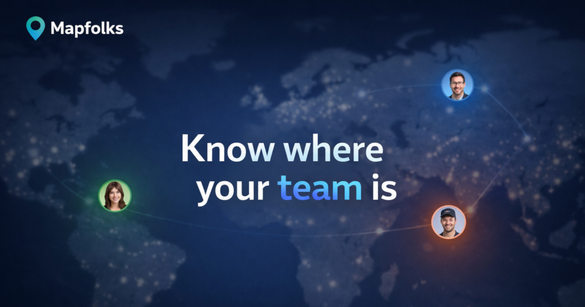
Fix these first
Ranked by conversion impactAdd a user/team count directly under the H1 - something like '2,400+ teams already on the map' or even '500+ distributed teams use Mapfolks' if that is accurate. Place it between the H1 and the 'Create team map' CTA button. This single line of social proof is the biggest conversion lever missing from the hero section and takes under 30 minutes to add.
Add a visible pricing statement in the hero or immediately below the fold. The FAQ buries 'Is Mapfolks free to use?' - cold visitors will not scroll to find it. Add one line under the CTA button: 'Free to start - no credit card required' or state the actual pricing tier. Hiding pricing kills trust for B2B tools.
Replace the 'Teams' and 'Friends' tab buttons in the How It Works section with a single clear flow for the primary use case (teams). These tabs read as broken CTAs to a cold visitor and split attention. If both audiences matter, create two separate sections with distinct headlines rather than ambiguous toggle tabs.
Category breakdown
The primary CTA 'Create team map' is reasonable but appears twice (hero and footer) with no urgency or benefit reinforcement. The bigger problem is that 'Teams' and 'Friends' buttons in the How It Works section look like CTAs and create decision paralysis. The FAQ questions are also rendered as buttons, making the entire lower half of the page feel like a navigation menu rather than a conversion funnel. There is no secondary CTA for visitors not ready to create a map.
There is effectively zero social proof on this page. The scrape shows star ratings exist but no named testimonials, no customer logos, no user count, no case studies, and no press mentions. The only human presence on the page is 'Created by Sergey Atroshchenko' in the footer. For a tool asking teams to share location data, the absence of any proof that real teams trust this is a critical conversion killer.
A product asking users to share location data has almost no trust infrastructure. There is no pricing page, no money-back guarantee, no security badge, no team or company page, no mention of how many users or teams are on the platform, and no indication of company size or legitimacy beyond a solo founder credit. The Privacy Policy link exists but burying trust in footer links does not convert skeptical visitors. The meta description mentions 'your data stays private' but this does not appear prominently in the visible page body.
'Know where your team is' communicates the category but not the differentiation. The subheadline 'A simple map for distributed teams - see locations and timezones at a glance' is better and actually does more work than the H1. A cold visitor understands the general concept in 3 seconds but has no reason to choose Mapfolks over Google Maps pins, Notion, or Slack status fields. The headline is generic enough to describe five different products.
Based on page structure, the hero headline and CTA should render acceptably on mobile. However, the FAQ section with seven questions rendered as buttons will likely stack into a long scroll on small screens, pushing the final 'Get your team on the map' CTA far below the fold. The 'Teams' and 'Friends' tab interface in the How It Works section may also be confusing on touch screens if the active state is not visually clear. Only 2 images on the entire page suggests limited visual hierarchy to guide mobile users.
The page lists features (shared locations, global team map, flexible updates, private by default) but never states a concrete outcome. What problem does this solve that Slack status or a shared spreadsheet does not? The copy 'Stay in sync across timezones' is vague. There is no before/after framing, no pain point named, and no quantified benefit. 'See where your team is' is a feature, not a value proposition.